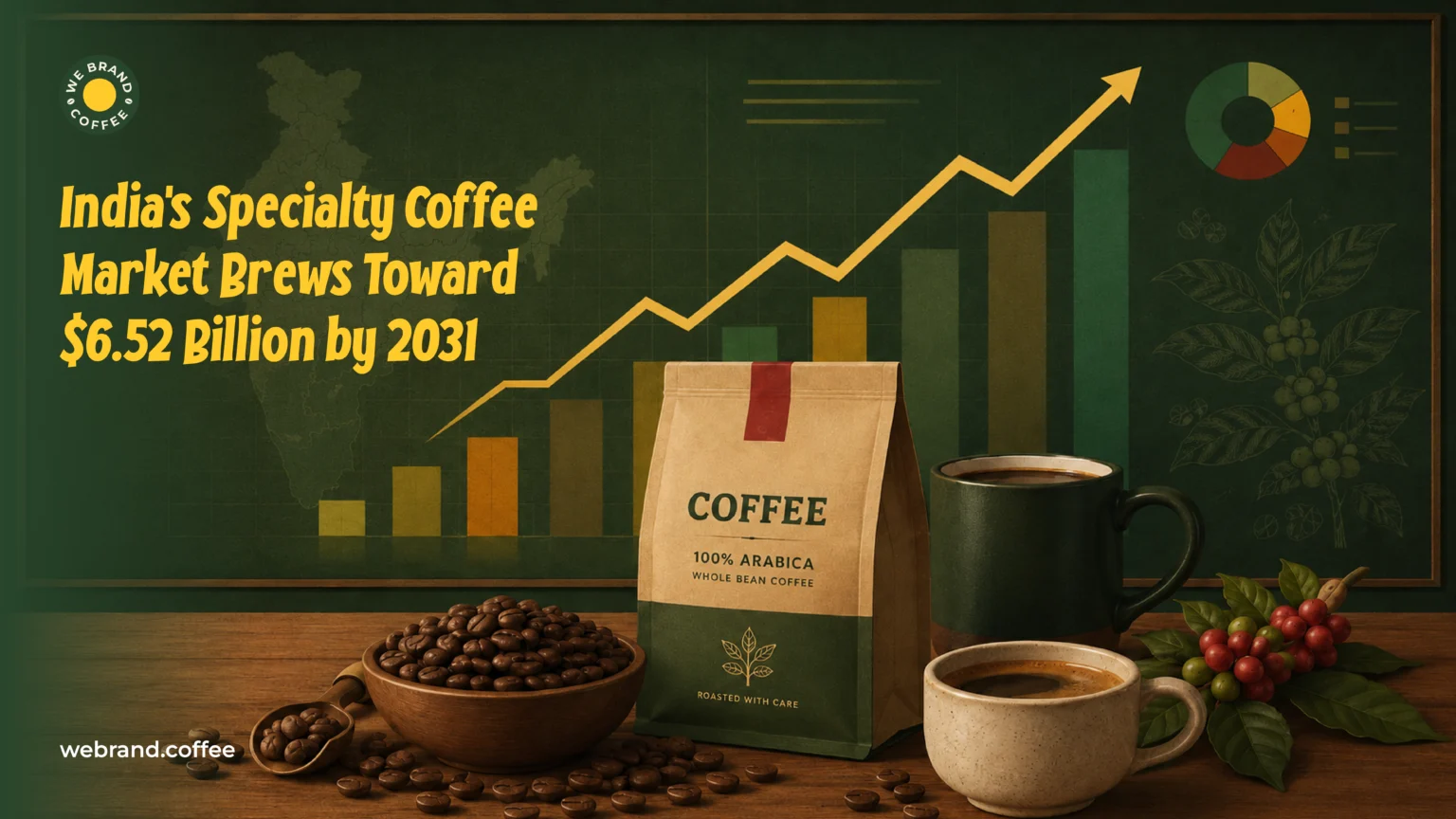
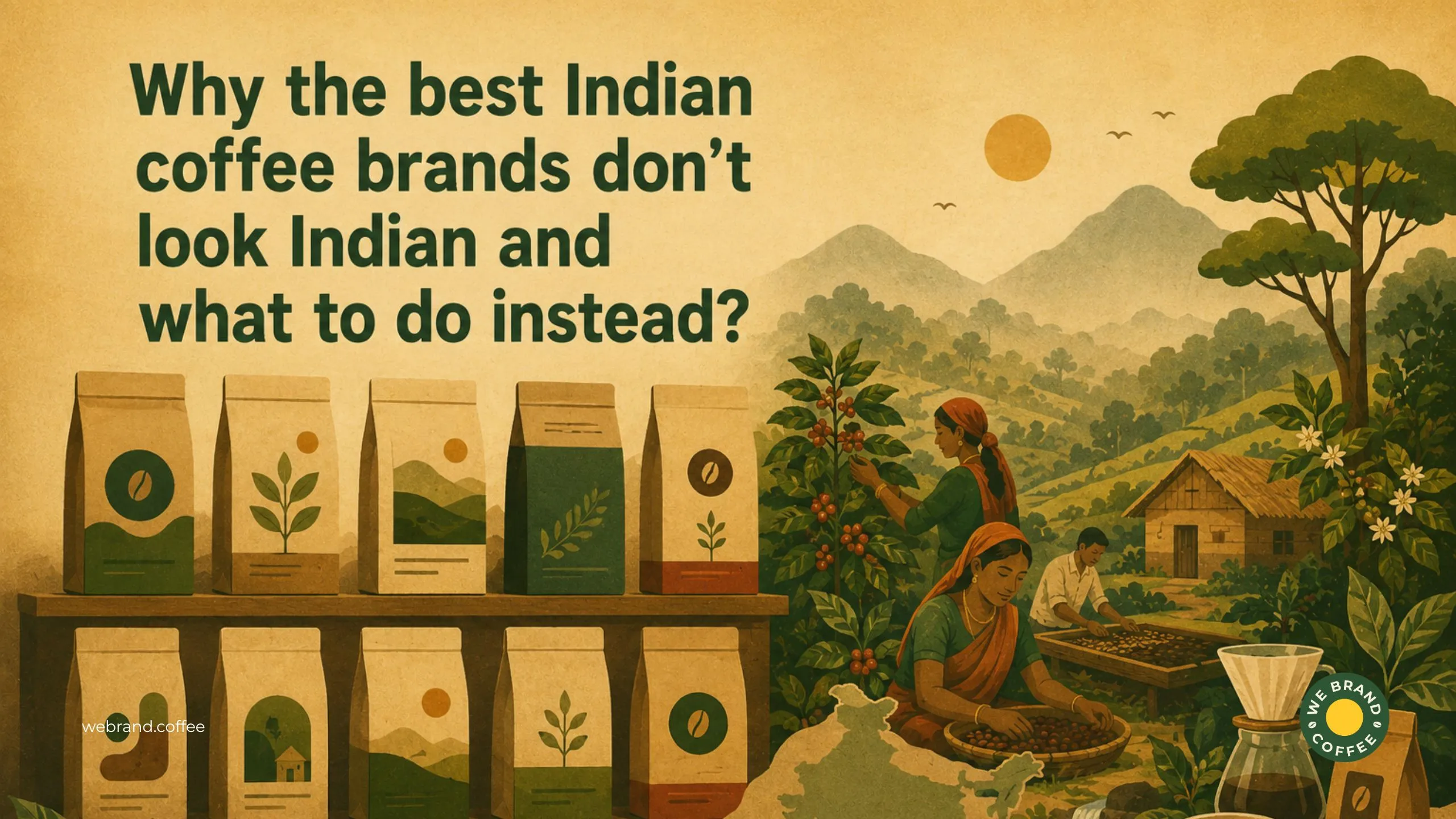
Why the best Indian coffee brands don’t look Indian and what to do instead?
Recent Posts
Share this article:
Put ten of India’s most awarded specialty coffee brands side by side. Cover the names, could you tell they were Indian? What you would see instead is kraft paper, the colour of old parchment, lower sans-serif in a weight that says “speciality”, abstract botanical, geometric, a palette that suggests fog and restraint where negative space is deployed like an amoral position.
The visual grammar is consistent, confident, and recognisable. It’s just not Indian. Think about it, coffee brands that evoke the Western Ghats, estates in Coorg, tribal communities in Akaru, the provenance is Indian, but the visual language? That belongs to Copenhagen or Poland, with just third-wave aesthetics that somehow now functions as a universal signal for quality coffee.
But this is not a criticism of those brands; they are made from rational decisions, and many of them built real businesses on the back of those decisions. Rather, this is a question about something different. It is a question of what gets left on the table when an entire origin country disappears from its own visual narrative.
Why did this happen?
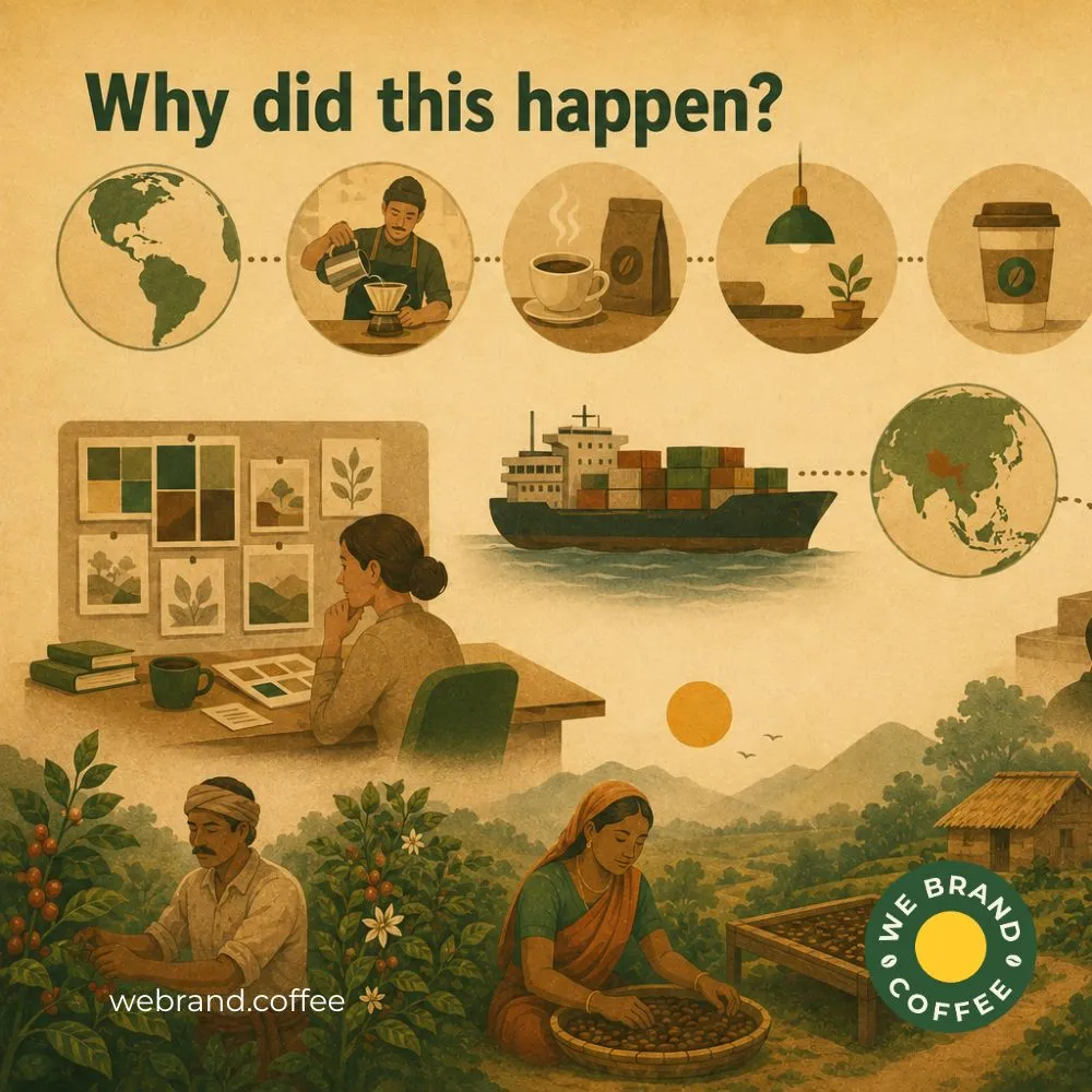
To understand this shift in the visual choices Indian speciality coffee brands made, you have to understand the timeline of the coffee industry in India at that point where the third-wave movement was born in the West. Single craft, muted palettes, rejection of mass-market loudness, and minimalism as the visual equivalent of “we take this seriously” were set in the early 2010s. And by the time Indian speciality brands started building their identities, that visual language had already calcified into a credible signal. It was a shorthand of if you look like them, the world will believe you are as good as them.
It worked, it did. Awards were won, stockists were found, buyers who had never tasted a Bababudangiri washed or a Chikmagalur natural took them seriously because the brand said, visually, that they should. Coffee brands that might have told a genuine Indian story, one rooted in a specific place, a specific farming tradition, a specific sensory landscape, had already committed to a borrowed aesthetic.
Having said that, there’s a deeper mechanism, underneath this, when a brand’s entire reference pool is Western, when the mood boards are all Brooklyn roasters, Indianness stops being a story to tell and stats being a liability to manage. The origin country, the very thing that should be the brand’s irreducible advantage, gets minimised into a tasteful mention.
What does “looking Indian” usually mean, and why does it fail?
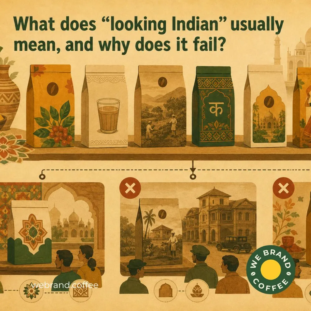
At some point, many of these coffee brands try to find a middle path; they want the craft credibility of the Western aesthetic, but they also want to signal origin, so they reach for the toolkit that says India most legibly.
Which tool kit? Saffron and turmeric palettes, rangoli-adjacent geometric patterns, hand-drawn chai cups on bags of single-origin filter. Legit, colonial-era vintage illustration in sepia. Devnagri script deployed as decoration, a mark of cultural authenticity without any real engagement with typographic tradition.
Where these are not bad design elements, the problem is that they communicate when assembled into a specialty coffee brand and the cultural symbols repurposed as aesthetics. They signal India without attempting to understand it. The problem is especially acute for speciality coffee because of category confusion. When a bag of single-origin washed Arabica from a Nilgiri micro-lot uses turmeric tones and chai-coded illustration, the visual is fighting the positioning. The design is telling the buyer they are about to drink something warm and comforting and familiar, while the product is actually about brightness, altitude, and terroir. The packaging undermines what’s in the bag.
However, there are three distinct failure modes in this space, and they are worth naming separately:
- Decorative ethnicity
One of the most common, Indian, rendered as a pattern rather than a story. Either the brands are using Indian visual motifs the way a hotel lobby uses world maps as decoration, which signals cosmopolitan awareness without communicating anything specific.
- Colonial nostalgia
The estate imagery, the sepia tones, is a real visual tradition, but it belongs to a version of Indian coffee history that is reaching for that aesthetic to signal “heritage”.
- Generic desi
The turmeric palette and chai-coded visual language that collapses all of Indian food and beverage into one sensory cliché. It might work for a masala chai brand.
In general, there’s a version of “looking Indian” that is really just looking like what a non-Indian thinks India looks like. That’s not your coffee brand identity; that’s tourism branding.
The reframe of what Indian visual identity actually contains
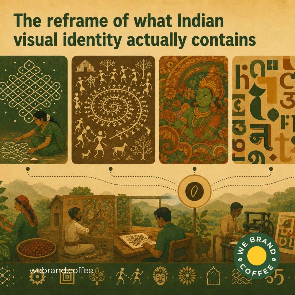
Indian coffee brand identity almost always misses that the problem is not that Indian coffee brands look Western, but rather the problem is that when they try to look Indian, they only end up reaching for the surface. All while the depth is right there, untouched, unbranded, completely available.
While India’s visual tradition is one of the richest and most structurally sophisticated in the world. But coffee brands are drawing from a tourist-facing silver of it, the symbols, not the systems.
- Kolam geometry
Kolam geometry is not an ornament. It is a mathematical rhythm translated into space; it teaches balance, symmetry, movement, and negative space with a level of sophistication most modern coffee packaging systems still struggle to achieve.
- Warli line work
If you think Warli line work is not just about tribal aesthetics, but rather it is a proper visual economy and a masterclass in narrative reduction where human movement is communicated through repetition, rhythm, and proportion using almost nothing.
- Kerala mural tradition
Kerala mural traditions understand colour with a confidence that modern premium branding often avoids, where density reflects without chaos, saturation without the loss of hierarchy, and richness that still feels controlled.
- Early NCPA poster design
Institutes like NCPA, especially often, experiment with typography in ways that still feel radically alive today, with shifting scales, multilingual tension, spatial drama, and graphic confidence without apology.
Having said that, know that these are not just aesthetic references; these are structural languages whose distinction changes everything because the future of Indian coffee branding is probably not about making brands look more Indian on the surface. Additionally, understanding what Indian visual identity actually contains requires an entire system sophisticated enough to build globally distinctive coffee identities without needing to perform culture loudly to prove authenticity.
The WeBrand framework: three ways to own Indian identity without performing it
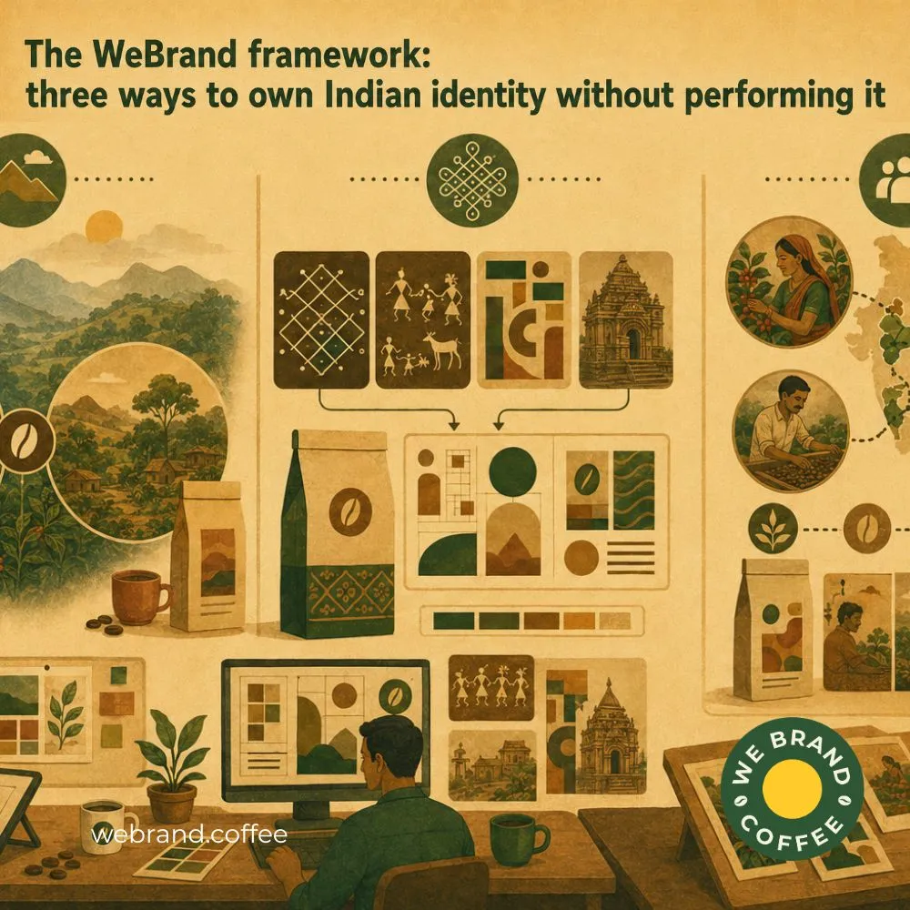
The future of Indian coffee branding is not about adding more cultural symbolism. Building an Indian identity in coffee branding that is deeply rooted in places, structure, and perspective is all about executing it in a manner such that it does not need to announce its “indianness” loudly to feel authentic.
At We Brand Coffee, we think that most coffee brands approach visual identity backwards. What they do is start with aesthetics, rather than starting with the visual truth of what parts of this origin, this landscape, this culture, this production story are actually ownable. That is one distinction which changes the entire coffee branding process.
Here’s what we at We Brand Coffee follow to own our Indian identity in coffee branding without performing it.
- Treat origin as geography, not mythology
Heritage, tradition, culture, legacy, craft; these are words so overused that they have stopped communicating anything tangible, but before that, coffee as a crop physically grows in altitude, absorbs rainfall patterns, develops under specific soil conditions, and tastes different because the geography it is grown in behaves differently.
For example, Coorg’s monsoon texture is different from Araku’s tribal terroir; similarly, Chikmangalur carries a different visual atmosphere than the Nilgiris.
- Draw from the structure of Indian design, not its symbols
Most coffee brands mistake symbols for identity, and crowd the branding with mandalas, elephants, hand-drawn motifs, and ethnic typography, but Indian visual culture was never powerful because of isolated symbols; rather, it holds impact because of systems. Kolam teaches spacing and rhythm, warli work teaches reduction and movement, Indian modernist poster design teaches typographic confidence, and temple architecture teaches sequencing and visual hierarchy.
- Treat the human supply chain as a design asset
India has one of the most specialised coffee markets with extreme human diversity across coffee-growing communities. Different labour histories, different farming structures, different cultivation traditions, and different regional relationships to coffee itself, yet most coffee branding reduces all of this into a generic “farmer story. That’s a missed opportunity.
The whole idea is to create visual systems that feel distinct, rooted, and impossible to mistake for generic global minimalism, even if the viewer cannot immediately explain why. At We Brand Coffee, branding is all about understanding culture deeply enough to build from its logic instead.
A challenge, not a conclusion
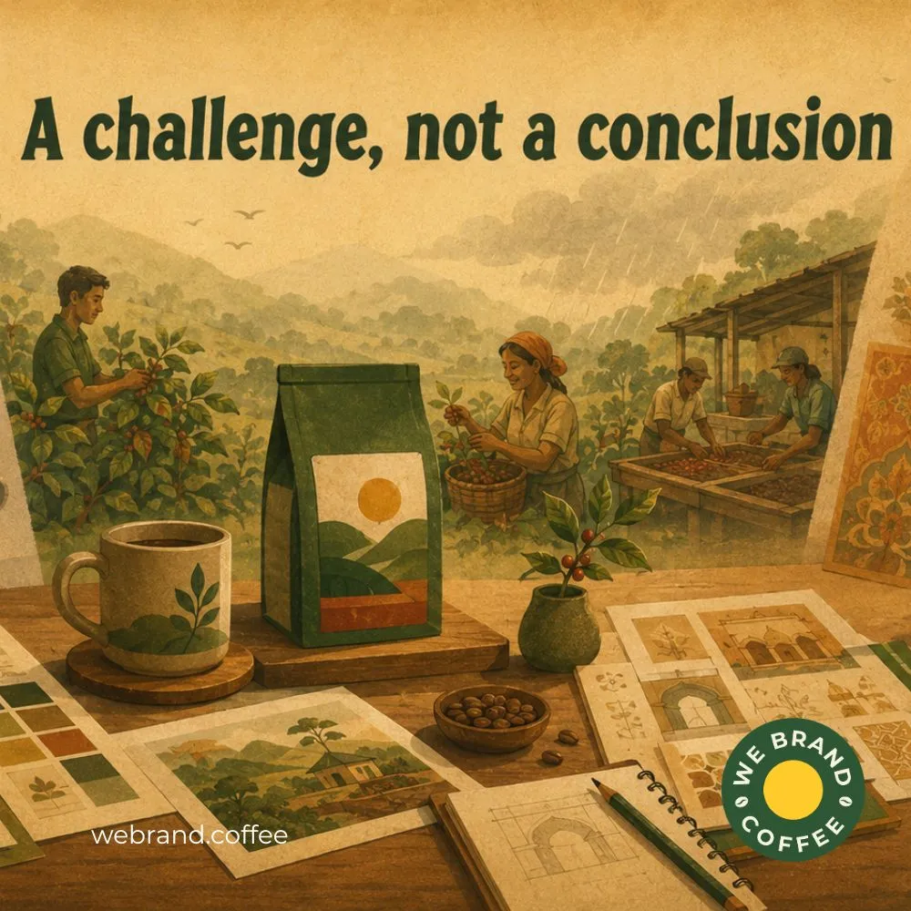
Maybe the next great Indian coffee brand will not be the one that looks the most Scandinavian, and won’t try to prove its cultural authenticity through turmeric palettes, mandalas, and decorative nostalgia.
We build a brand that understands the difference between borrowing culture and building from it, because Indian coffee does not lack visual identity. It lacks coffee brands willing to engage with that identity deeply enough to move beyond the surface.
FAQ
Brands use clean, global aesthetics to challenge traditional perceptions of Indian coffee as purely commercial commodity beans. Modern visual identity, combined with sleek FMCG packaging design, appeals to cosmopolitan consumers looking for world-class specialty coffee experiences.
No, top brands combine sleek, international aesthetics with precise local origin details inside the copy and tasting notes. Expert food product packaging design highlights Indian estate sourcing while presenting it in a polished, modern format.
Universally appealing food design packaging makes it easier for Indian brands to enter competitive Western and European specialty markets. Sleek typography and subtle branding allow the product to fit seamlessly onto international retail shelves.
Legacy visual tropes can cause a premium specialty brand to look like low-grade, mass-market instant coffee. Modern consumers often associate traditional red-and-gold commodity packaging with commercial, heavily processed blends rather than artisanal design packaging food.
They feature modern, minimalist layouts on the front panel while telling authentic stories about local estates and farmers on the back. This pairs sleek contemporary food pack design with rich, grounded cultural origins.
Recent Posts
Related Posts