What Our Coffee Shop Logo Design Process Looks Like
Recent Posts
Share this article:
Many coffee startups come to us after a rough first attempt at branding. Maybe the coffee shop logo design was left unfinished, or maybe it was built using an online tool that looked fine on a screen but fell apart the moment it hit real packaging. Often, the result was a logo that could’ve belonged to any business: generic, safe, and forgettable, with nothing that made it theirs.
It Starts With Coffee, Not Design
Coffee is more than a drink for us; it’s a relationship. From the coffee farmers who tend the estate at dawn, to the roasters who coax out every note of flavour, to the cafe owners who pour that final cup into someone’s hands, we exist to help every link in that chain.
Our clients are coffee growers working small plots at altitude, roasters chasing the perfect profile batch after batch, and cafe owners building communities one order at a time. We work alongside all of them, not above them, because we believe great coffee only happens when everyone in the chain is set up to succeed.
That means fair, transparent sourcing with the farmers who grow it. It means a reliable, high-quality supply for the roasters who refine it. And it means a consistent, dependable partnership for the cafes that serve it to the people who matter most: the drinkers.
It is all about defining the core of your brand and its relationship with your target market. This is why every client who approaches us for branding help receives a complete brand questionnaire that gets to the core of their business.
What does the Brand Questionnaire cover?
The questionnaire is designed to extract all the necessary information about your brand. We ask you questions about your business. Some of them are the following:
Coffee Origin: For brands that have something to do with coffee, knowing the origin of the beans used to make the drink can be an integral part of the brand’s message and values, such as sustainability and quality.
Target Audience: Knowing your customer is a critical part of making a good brand. It allows you to tailor your branding strategy to your customer’s needs.
Pricing: A pricing framework tells a lot about the brand. For example, luxury brands might require a completely different visual language compared to more budget-friendly ones.
Brand Personality: What kind of personality should your brand possess? Should it be playful and fun or elegant and sophisticated? Emotional aspects of the branding are key to creating a logo for your cafe.
However, initially, a lot of our clients underestimate the importance of the discovery call. But this 30-minute discussion can totally change the outcome of the logo and the whole branding process. Talking about the questionnaire’s results and discussing other nuances allows us to create the right messaging and visuals for your audience.
Those clients who avoid doing that crucial step end up with a coffee logo that cannot convey the whole brand identity. This usually means that there is no consistency in the message and there is no emotional connection between the audience and the brand.
The questionnaire is designed to extract all the necessary information about your brand. We ask you questions about your business. Some of them are the following:
Coffee Origin: For brands that have something to do with coffee, knowing the origin of the beans used to make the drink can be an integral part of the brand’s message and values, such as sustainability and quality.
Target Audience: Knowing your customer is a critical part of making a good brand. It allows you to tailor your branding strategy to your customer’s needs.
Pricing: A pricing framework tells a lot about the brand. For example, luxury brands might require a completely different visual language compared to more budget-friendly ones.
Brand Personality: What kind of personality should your brand possess? Should it be playful and fun or elegant and sophisticated? Emotional aspects of the branding are key to creating a logo for your cafe.
However, initially, a lot of our clients underestimate the importance of the discovery call. But this 30-minute discussion can totally change the outcome of the logo and the whole branding process. Talking about the questionnaire’s results and discussing other nuances allows us to create the right messaging and visuals for your audience.
Those clients who avoid doing that crucial step end up with a coffee logo that cannot convey the whole brand identity. This usually means that there is no consistency in the message and there is no emotional connection between the audience and the brand.
Why Does Skipping the step show in the Final Design?
When organizations fail to complete the basic processes of branding, they often lack the important features that make their brand identity distinctive. Unoriginal cafe logos and poor brand positioning are the usual mistakes made by companies that fail to take into account:
Understanding: If a company does not delve deeply into the brand itself, the results will turn out to be plain and unconnected to the brand.
Communication: If there is no understanding of the brand, then the coffee house logo design won’t fit with the message delivered by other promotional tools.
Connection with the Audience: The lack of connection to the audience makes the coffee house logo dull, which decreases brand loyalty and recognition.
Takeaway: Understand coffee brands, not design.
Before We Touch a Pencil, We Build the Brand’s World
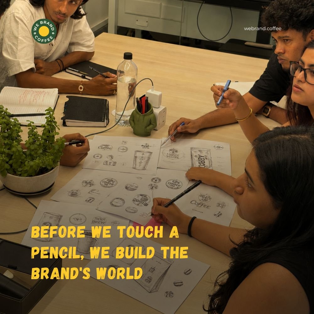
It is necessary that when creating the visual mood board for a coffee brand, the visuals used should be consistent with the brand positioning. This is how one creates an effective mood board, taking into account the variances in perception among consumers of different coffee brands.
Specialty/Third Wave vs. Mass Market vs. Heritage Mood
Mood for Specialty / Third Wave Coffee:
In this case, the mood would be all about the artisan nature, sustainability, and uniqueness of the product. Earth tones would be used along with images that would showcase the origin of the coffee.
Mood for Mass Market Coffee:
In this case, the mood would be based on the availability and convenience of the product. Colorful images and crisp designs would be suited for this mood.
Mood of Heritage Coffee:
Heritage mood signifies tradition and nostalgia. Rich colours and classic fonts will be great choices for such imagery. Vintage coffee advertisements, traditional ways to brew coffee, and family gatherings based on coffee.
Competitor Logo Analysis
Conducting an analysis of the logos of your competitors will help you determine which visual elements have become cliché in the industry. Using the analysis of the successful brands, you will be able to find out those aspects and symbols that you should deliberately avoid using to make sure that your brand is distinctive.
Why Two Coffee Brands with the Same Brief Should Never Look the Same?
Even though two coffee brands could have an identical target audience or brief, their visuals need to be very different from each other. This is because each brand carries its own history and character that need to be communicated through a unique design. In doing so, they will better connect with their target audience and stand out among the other brands.
Color Psychology Specific to Coffee
Color psychology is very important to know in order to create effective branding in the coffee industry. Now let us see how each of the above-mentioned colours might influence customers:
Earth Tones: These colours represent authenticity and environmentally friendly products related to nature, so they will appeal to environmentally-conscious customers.
Black: It is a colour of sophistication and intensity; thus, it might help to create an image of a premium product.
Gold: It represents elegance and high-quality, so it might be used as a colour for a special class of coffee.
Reader Takeaway: There is much strategy in the design.
Why We Always Design 3 Directions, Never Just One
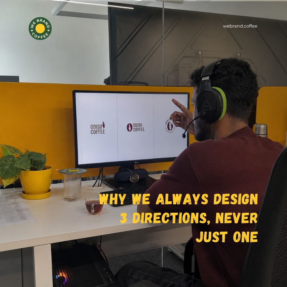
One of the elements of our process is related to the way we present concepts. We always show three directions, and we never show two. With only two directions, the client must choose one direction or another, and the choice is made not because he understands something, but because his instinct tells him which direction to take. By giving third directions, we shift the focus away from making choices to explaining why things work. “I like this font, but I don’t like that icon,” or “This direction is good, but let’s simplify the mark.” This is the kind of feedback we need to create an emblem that is truly owned by the client.
What Revision Rounds Actually Look Like in Our Process
Our process is designed specifically to address the issue of your coffee brand. Our goal for all coffee start-ups is to provide more than a coffee shop business logo. What we strive to give them is an emblem that will accurately depict the spirit of their brand.
Revision Rounds: We provide 2-3 revision rounds depending on the package you choose in order to achieve a balance between the level of improvement and unnecessary repetitions.
Refinement vs. Restart: Refinement implies making the logo for a coffee shop better, while restarting means something is wrong with the brief.
Working with New Directions: In case clients want to change the direction after our approval, we talk about its consequences and try to understand their needs to get back on the right track.
Focused Criticism: The best coffee logos may be created through focused criticism, not numerous reworks, since constructive criticism is very important in this case.
Impact of Small Changes: Small changes in logo design, such as changing its color or font type, may significantly affect its quality.
The Main Idea: They are structured yet adaptable; reworks are intentional yet limited.
The Discovery Brief: It All Begins with Coffee, Not Just Design
To come up with an identity for a unique brand in today’s highly competitive world, it is extremely important to choose the right color scheme and typefaces, which will characterize the identity of a brand. This is why we provide each of our clients with a comprehensive brand questionnaire.
What’s Included in the Brand Questionnaire?
Coffee Source: It is essential to understand the origin of the coffee beans, which will bring to light the unique story of your brand and its values, especially when it comes to aspects such as sustainability and high quality.
Target Audience: The knowledge of your target customer is important for creating a proper branding strategy targeted at reaching and engaging this audience.
Pricing Strategy: Your strategy concerning prices can say much about your brand. For instance, premium coffee brands will need another design than the budget ones.
Brand Personality: Knowing the way you want your brand to be seen – either playful and fun, or luxurious and elegant – will help in the creation of the coffee cafe logo design and your brand image.
It is important to emphasize how much such a discovery call can affect the final logo design for many of our clients. This 30-minute call will allow us to talk about the results of the questionnaire in more detail and explore all the nuances. Omitting this key stage will result in an inability to create a logo that reflects the true essence of the brand and leaves no chance for the proper messaging and connection with the consumer.
Brand Mood & Direction: Defining the Brand’s World
Even before we design the logo, we come up with a visual mood board matching your brand strategy through imagery, colors, and textures. Here are some approaches to consider according to the coffee markets:
Specialty/Third Wave Mood Board: It should feature artisanal quality and the sustainable nature of coffee. One can use earthy colors, handcrafted visuals, and visuals showing where the coffee comes from. Raw wood and burlap textures could work here.
Mass Market Mood Board: The ease of obtaining the product will be highlighted through the use of bright colors and well-designed images. Images will depict vibrant coffee shops or people consuming coffee in natural settings.
Heritage Mood Board: The traditional mood will be created through the use of vibrant colors and classic fonts. Vintage coffee ad images and historical ways of brewing coffee will help in building an emotional connection with consumers.
Competitor Logo Analysis: It is crucial to carry out a full-fledged analysis of competitor logos. With the help of the research, it is possible to determine the cliché elements to avoid, thus designing a logo that will stand out among the existing ones and inspire creativity.
Key Takeaway: They pay attention to where the logo actually resides, not just where it lives onscreen.
What You Actually Get at the End, And Why It Matters

All cafe logos we create for you are specially designed for you from the concept development phase to the final files. We will give you all the graphics you need for use in both digital and print formats, so that you have everything you need for your website and packaging.
Conclusion
It is vital to have an outstanding logo for the café, which has been personalized specifically for your coffee so that you can differentiate yourself from the competition. This will make sure that you have a distinctive identity for your brand. Do you want to speak in the voice of your brand? Let’s start now!
FAQ
Agencies begin with an in-depth consultation to design cafe logo assets and uncover your cafe’s origin story, vibe, and audience. This foundational research ensures the visual design aligns with your physical store layout and brand goals.
Designers explore multiple initial visual concepts for a coffee logo design, ranging from clean modern marks to intricate hand-drawn crests. The best ideas are refined into polished directions for the client to review and select.
Collaborative feedback rounds allow clients to fine-tune chosen coffee logo concepts, adjusting typography, spacing, and proportions. This ensures the final mark hits both marketing goals and the founder’s personal brand vision.
A coffee shop logo design is thoroughly tested for outdoor store signs, window vinyl decals, barista aprons, and paper cup prints. Optimizing for real-world production ensures clear execution across all physical store surfaces.
Clients receiving a logo for a coffee shop package get master file formats, color guides, typography specs, and a brand book detailing correct usage. These guidelines ensure future designers and printers keep your brand visuals completely consistent.
Recent Posts
Related Posts