Coffee Packaging Design That Sells: Beyond Just Looking Good
Recent Posts
Share this article:
Just walk down the aisles in the coffee section or check out the website catalogue of a specialty coffee roaster; it will not take you long to realize one thing:
The coffee industry is overcrowded. With all the competition from other specialty roasters to grab consumers’ attention, it is no longer enough to have high-quality coffee beans alone. Attract more customers by packaging your coffee well.
Making attractive packages of coffee involves creating a good blend of aesthetic communication, functionality, and practical considerations. This is a list of ideas that will help you create custom packaging for your coffee.
Brand & Audience Understanding

Identifying your brand identity is more important than moving straight into colors and bag designs. Are you providing the friendliest cup for everyone in the morning? The premium single-origin specialty coffee? Or the green roastery? Your design must reflect the true essence of your brand identity. For minimalism, you would require a typeface, subdued colors, and negative space.
The bold and illustrative styles are more colorful because of the use of custom drawings and funky graphics. The traditional styles include the use of natural kraft paper, stamps, and traditional crests, which are meant to reflect the concept of artistry.
Master the Must-Have Functional Features
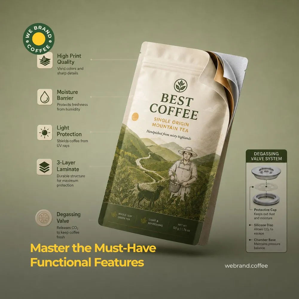
The design of the coffee bag might look attractive, but the whole purpose of coffee packaging is to keep the coffee beans protected, since the coffee beans are very delicate and sensitive to factors such as light, air, moisture, and heat. To keep your coffee beans protected, you can employ the use a one-way degassing valve, which will ensure the safety of your coffee beans, as carbon dioxide gas is released by the coffee beans for several days after the roasting process. The one-way degassing valve releases CO₂ but not oxygen into the bag.
Organize Information with Clear Visual Hierarchy
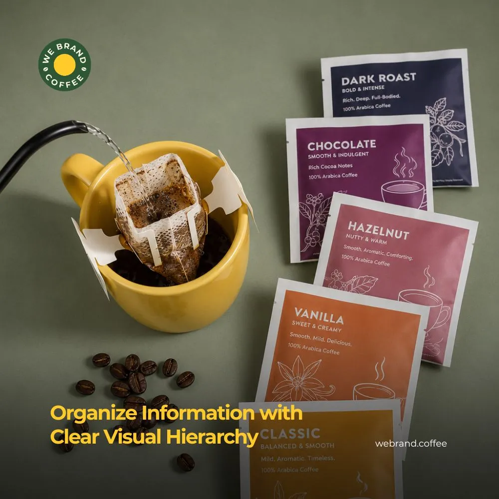
Buyers of coffee use different indicators based on how much they are into specialty coffee. Your label information should be organized to make reading quick and easy:
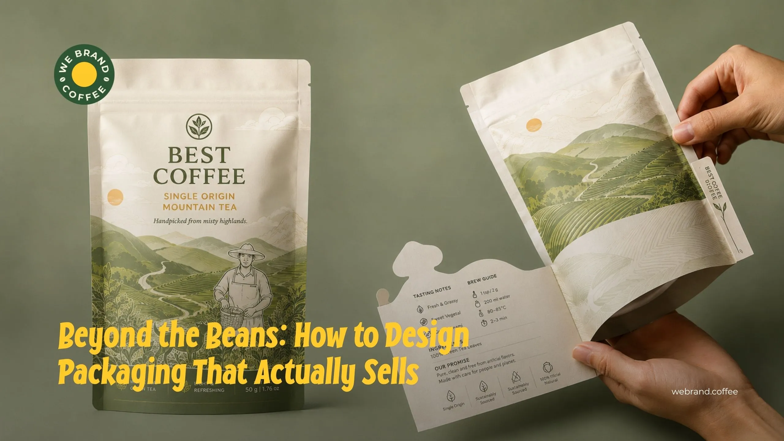
Front of Bag: Ensure that the front is clean and has fewer designs and contents on it. The brand name & Coffee logo design, the roast name/origin (e.g., Ethiopia Yirgacheffe/Morning Blend), the roast type (light, medium, or dark roast), and the net weight should be highlighted here.
Sides or Back: For those who want to go beyond that, include information about the taste profile, like jasmine, citrus, milk chocolate, etc. Provide information like altitude of 1800m, or washing method or natural process, as this tells a lot to specialty coffee buyers. Specialty coffee buyers need the roast date instead of the expiry date, and providing some suggestions about how the coffee should be brewed would help your customer make the most out of it.
Choose the Right Packaging Structure
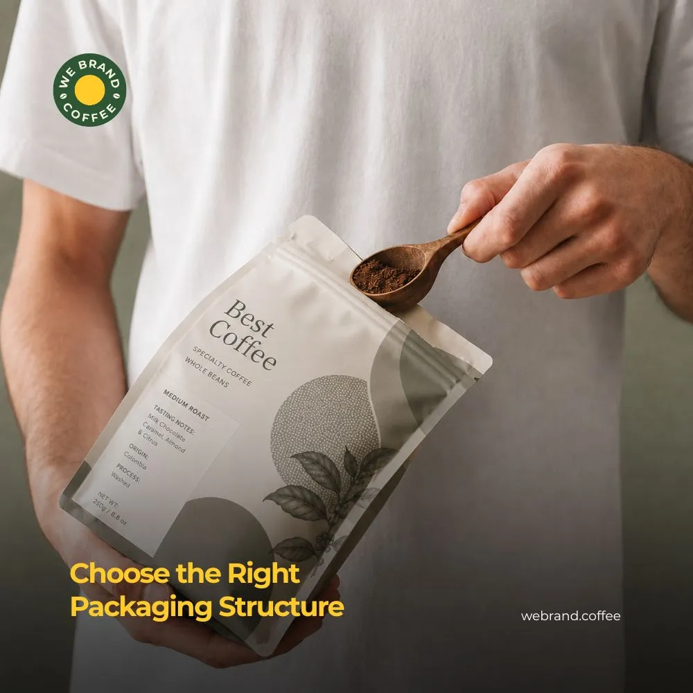
Stand-up packaging pouch or doypack are for versatile coffee brands, suitable for entry-level and mid-tier. The features of a doypack include being frugal, easy to pack, and lays flat while shipping. The flat bottom bag, also called a box pouch, is for premium specialty roasts, featuring sturdy stand-on shelves and providing five different printable panels. The side gusset bag is crafted for traditional, high-volume bags that feature a classic look and hold larger volumes cleanly. The canister or rigid boxes are suitable for high-end gifts or rare micro lots, which are reusable and have maximum shelf impact, providing a luxury touch.
Prioritize Sustainable Packaging
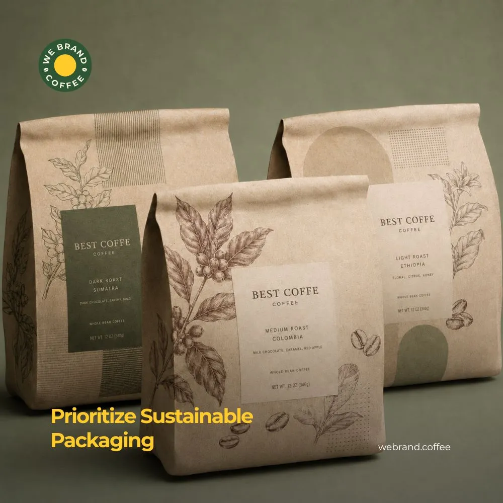
Consumers today are very conscious of how their morning coffee is affecting the environment. Using eco-friendly coffee packaging design is a way to enhance consumer loyalty. Use compostable materials like polylactic acid coating and kraft material on the outside that naturally decompose without fear of microplastics. Also, there are recyclable materials that are made of single-polymer plastic materials, which are 100% recyclable PE, hence making it easily recyclable and at the same time retaining an oxygen barrier. Finally, you could opt for non-toxic printing material such as soy- or water-based ink.
Conclusion
Always create physical prototypes. That design which seems awesome on the brightly lit screen may end up blending into the clutter on the shelf when viewed in natural light. Don’t clutter the bag with marketing jargon. Instead, focus on what is unique about your coffee beans or process. Ensure that the website URL is easily visible for easy repurchasing by a satisfied or loyal customer.
FAQ
Direct visual clarity-ensuring the brand name, coffee origin, and primary flavor profile are readable within three seconds. Removing visual clutter in packaging design for coffee makes the value proposition instant, streamlining the buyer’s shelf decision.
Structured, box-bottom bags with clean vertical lines convey premium quality better than limp, unstructured pouches. Crisp structural geometry in packaging coffee design presents your brand as an established, professional market leader.
Strategic colors trigger subconscious expectations; warm browns indicate boldness, while bright accents signal exotic fruit notes. Aligning packaging colors with customer taste expectations increases immediate buy-in and satisfaction.
Use unbleached kraft paper, matte earth-toned finishes, and clear eco-certification icons front and center. Transparent sustainability claims on food package design attract eco-minded buyers willing to pay extra for responsible packaging
Many buyers browse coffee on mobile screens where images are rendered as tiny e-commerce thumbnails. Bold typography and high-contrast graphics in food product packaging design ensure your package remains legible and appealing on smartphone displays.
Recent Posts
Related Posts