Recent Posts
Share this article:
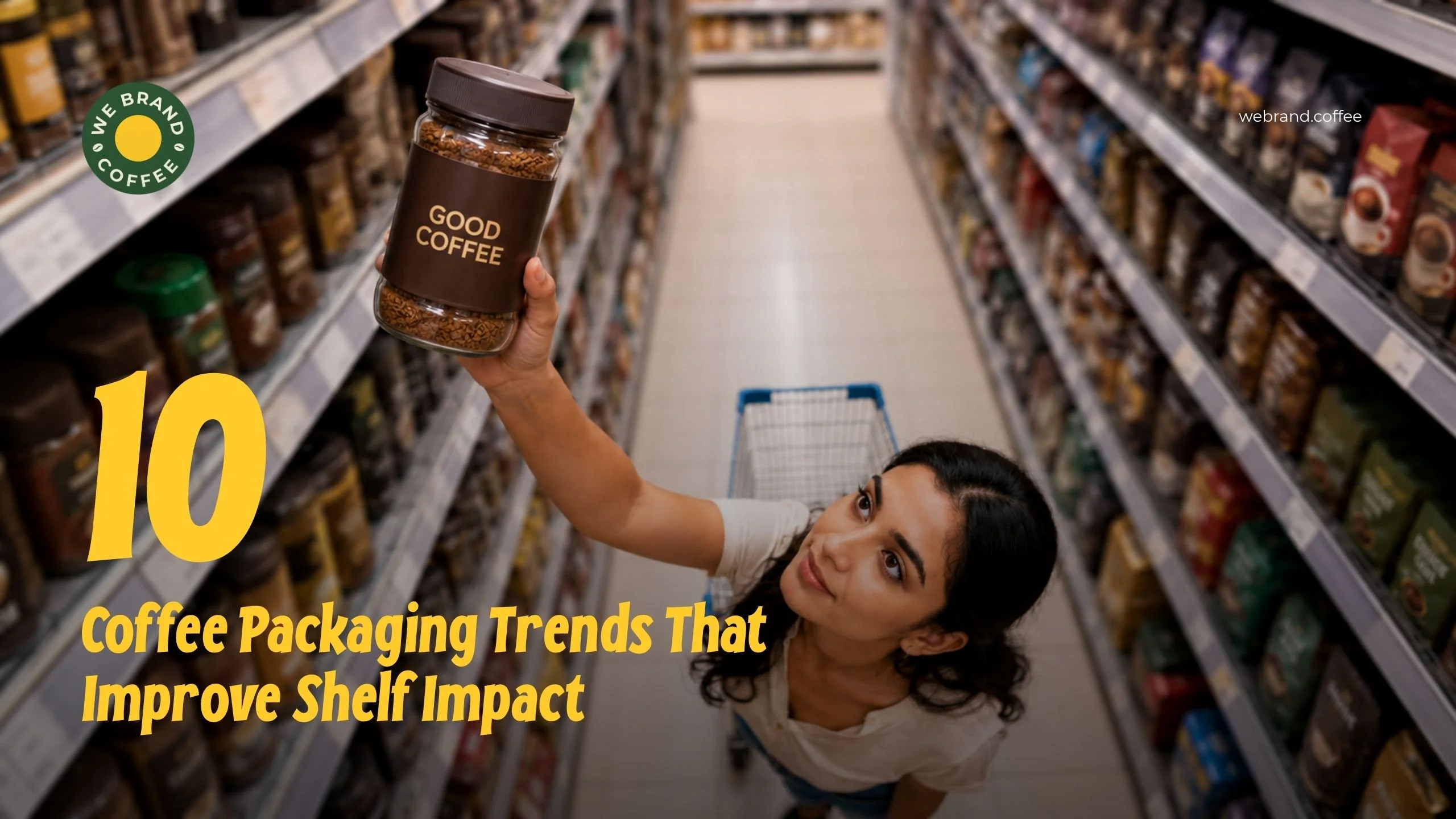
Coffee bags are not just containers that protect the beans but also market them. As a customer walks down the aisle, she surveys the shelves in a matter of moments. Your package must capture attention or risk going unnoticed, regardless of how delicious the coffee is.
This is the reason why coffee packaging design is as important as the quality of the roast. Effective packages capture attention and stop the scrolling, enticing customers in the process. The following are 10 packaging trends that are enabling coffee brands to stand out among the crowd.
1. Bold, Minimal Design
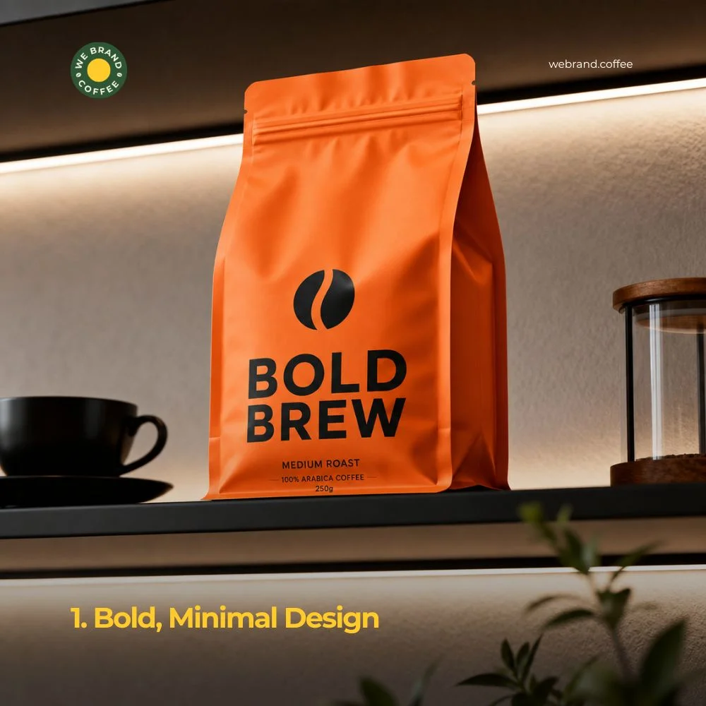
These types of designs blend simplicity with high-impact visual elements. Here, they use stark contrast, huge typography, and solid colours that pair with heavy negative space to grab attention. The core features include less fussiness and more text or product information. It has a single focus, like a coffee logo, wordmark, and punchy accent colour.
2. Matte Finishes With Spot Gloss
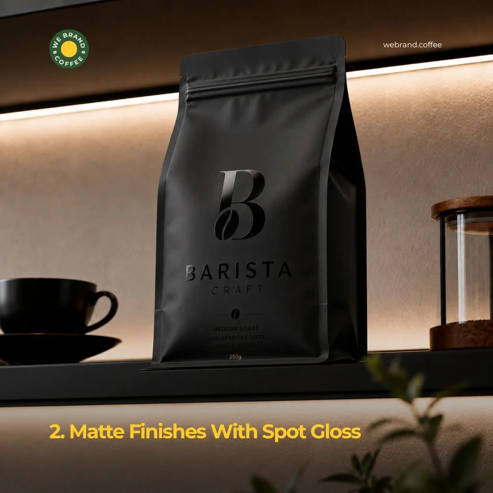
These types of designs are also called spot UV or spot varnish, where the base material gets a smooth, non-reflective matte coating. Where the shiny gloss is applied to the cafe logo design, text, or pattern. The combination has two advantages. Firstly, it creates visual interest without any additional clutter. Secondly, it creates the opportunity for people to interact with it physically. Bags are irresistible to pick up because they stand out from the mass of shiny plastic bags on the market.
3. Transparent Windows
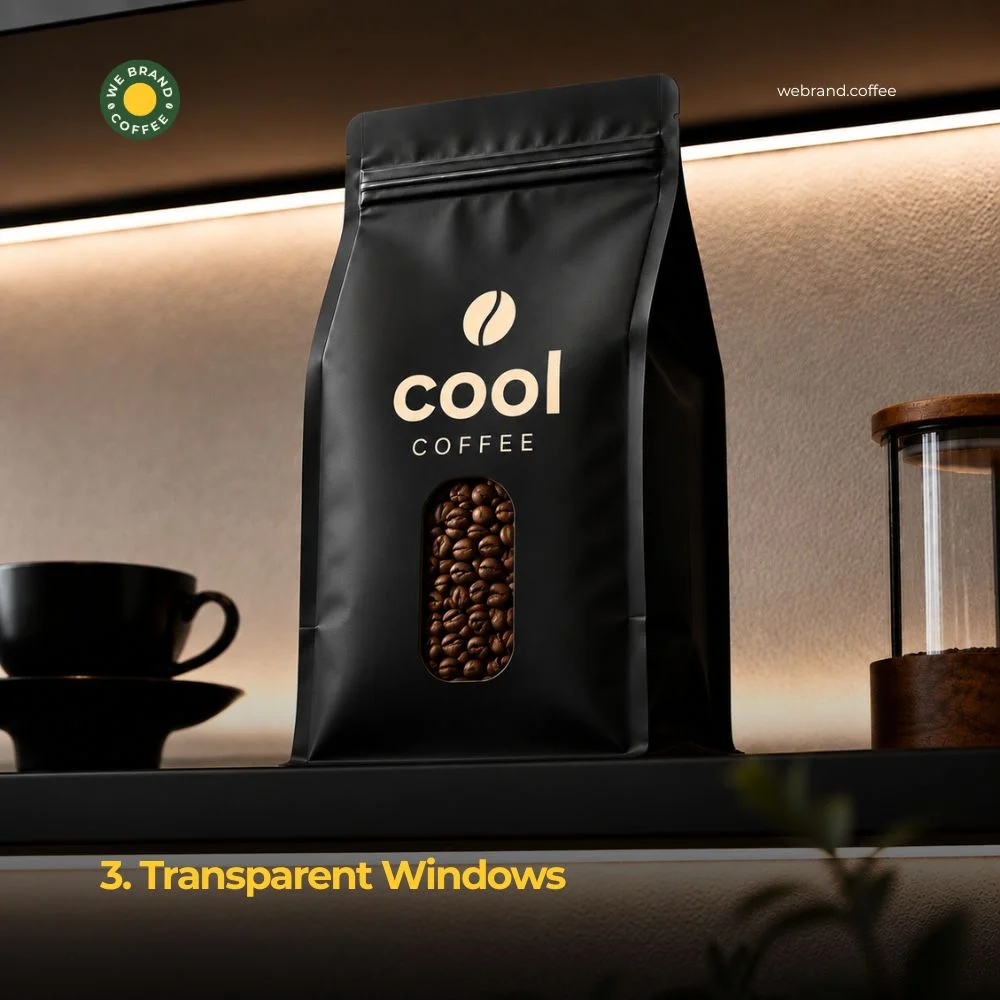
Seeing is believing. The inclusion of a transparent little window on the bag allows customers to see the real beans in the pack. This establishes trust straight away, particularly with new brands. Whole bean coffee looks appealing: oily, dark, and fresh. A window shows that off without saying a word. It also signals honesty. A brand that places its product under solid coffee packaging seems to be concealing something, even if it does not do so.
4. Sustainable and Compostable Materials
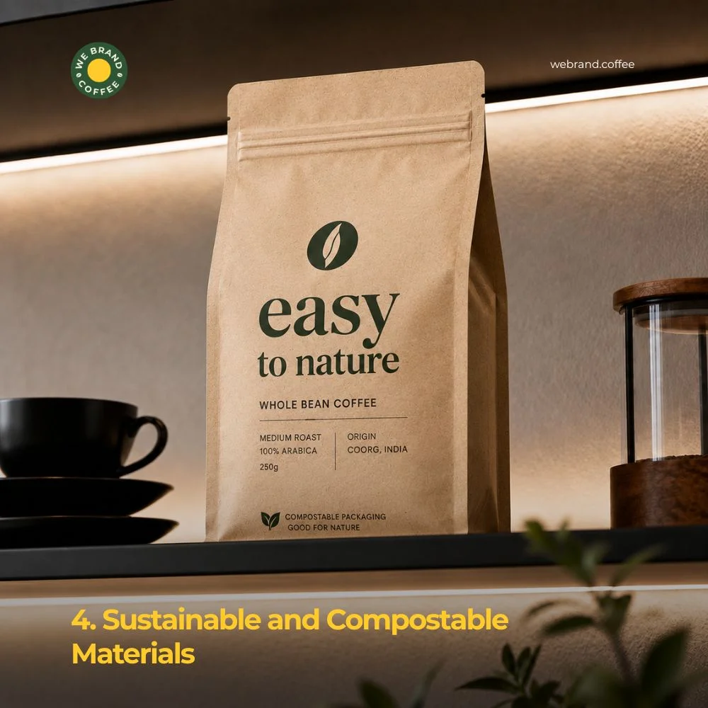
Traditional coffee displays feature brown, black, and white hues. However, new brands are defying patterns and introducing shocking colors such as pink, blue, and yellow into their displays. Why does this work? Contrast. Since all bags surrounding you come in the same earthy color scheme, a burst of color will attract everyone’s attention immediately, indicating that the brand is distinct, new, and daring. This trend works best when paired with strong typography. The colour grabs attention; the words seal the deal.
5. Bright, Unexpected Color Blocking
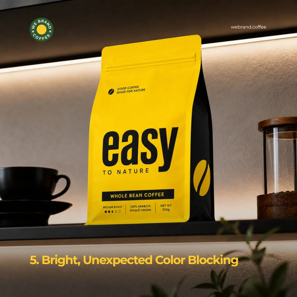
Coffee shelves have long relied on browns, blacks, and creams. New brands are breaking that pattern with bold, unexpected colours like hot pink, electric blue, sunshine yellow.
Why does this work? Contrast. When every bag around yours uses the same earthy palette, a bright block of colour instantly pulls the eye. It signals that the brand inside is different, fresh, and confident.
This trend works best when paired with strong typography. The colour grabs attention; the words seal the deal.
6. Resealable, Functional Closures
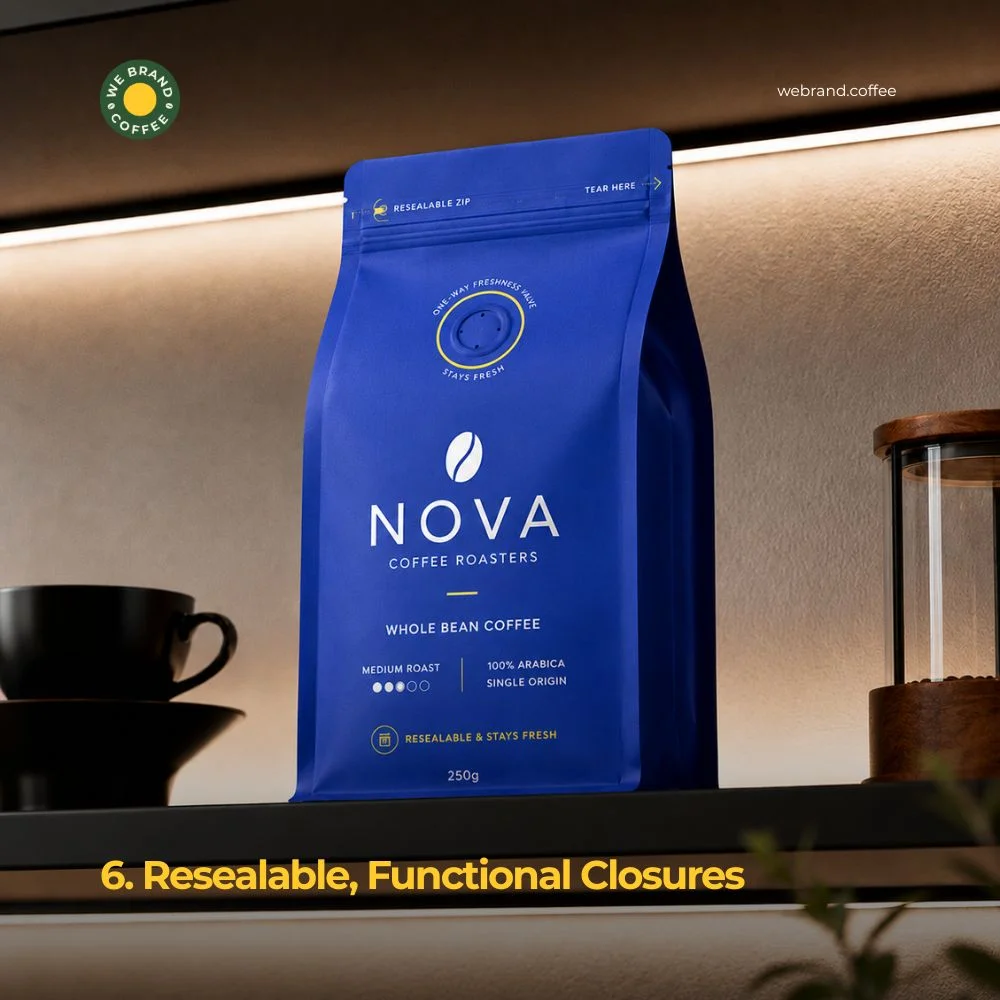
Shelf impact isn’t only about first impressions. It’s also about what happens after purchase. Coffee stored in bags equipped with tough zippers or valves remains fresh for a longer period, and consumers appreciate this quality. A great seal becomes a value in itself. Nowadays, some coffee packaging companies start using bright letters such as “Stays Fresh” or “Resealable Zipper” on the cover. In this way, a feature becomes a visual element, creating an image of trustworthiness. Freshness valves are small circular holes allowing the air to get out while preventing outside gases from entering. This feature is currently gaining visibility too. For instance, some companies add a colourful ring around this hole to make it a visible design element.
7. Custom Illustrations and Hand-Drawn Art
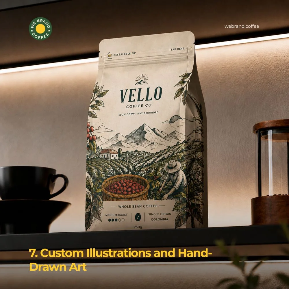
Photography can feel cold and generic. Illustration feels personal. More coffee brands are turning to custom, hand-drawn art like quirky characters, sketched landscapes, and playful patterns that build a unique identity. This trend works especially well for smaller, story-driven brands. The hand-drawn image of mountains could indicate where the coffee is from. A quirky mascot might reflect the brand’s personality. In any case, illustration helps create a distinct image that is difficult for competitors to duplicate.
8. Strong Typography as the Hero
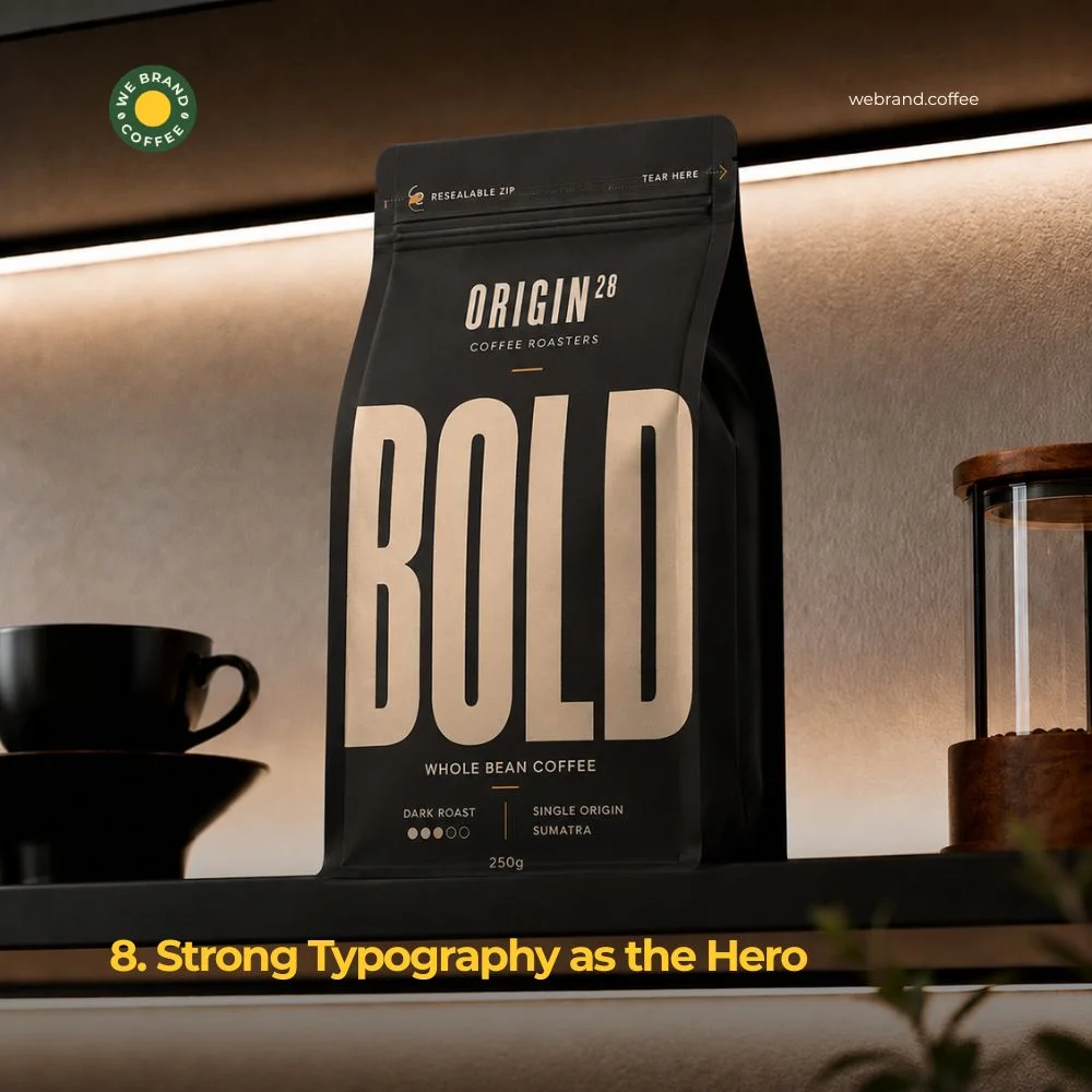
Sometimes the boldest design move is skipping images entirely. Typography-led packaging uses big, striking fonts as the main visual element. Just one simple word such as BOLD, SMOOTH, or DARK in big letters on the package may say more than any picture possibly can. This trend plays well with minimalism. Fewer elements mean the font itself becomes the star. The brands that use this strategy usually opt for an exclusive font which becomes an integral part of their identity, a font that is recognizable even when viewed from afar.
9. Matte Black and Gold Combinations
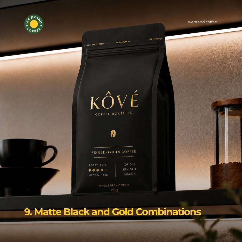
Luxury coffee brands are leaning into a classic pairing like matte black backgrounds with gold or metallic foil accents. This combination of design elements conveys premium quality even before a buyer touches the bag. The golden foil is designed in such a way that it gleams in an effect that flat printing cannot provide. Combined with the black color, the contrast looks luxurious. Such packaging trends fit in well with coffee products that have a specialty origin.
10. Storytelling Through Packaging Copy
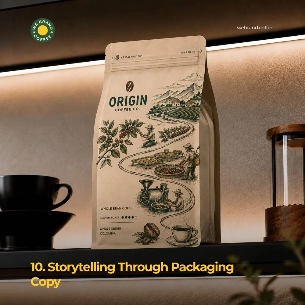
Design isn’t just visuals. The words on a bag matter too. Increasingly, more brands are employing catchy copy to create a story on their pack that tells you about where the coffee comes from, how it is roasted, or anything else that sets this blend apart. Successful brands prefer using short statements rather than lengthy paragraphs: Grown in volcanic soil. Roasted in small batches.Traded fairly, every time. This adds character without taking up time from the customer. A compelling story told through the use of a few words may be all that is needed to make a sale.
Conclusion
The concept of shelf impact rests on a single point, which offers consumers a motive to pause. Whatever it is, whether it’s a striking colour, a window panel, eco-materials, or a witty line of copy, every design decision must revolve around this point.
The companies that are successful in obtaining shelf space are not necessarily the most financially well-off. What sets them apart is an understanding of their consumer base and strategic product design. A strong brand identity, a powerful color scheme, and a couple of functional design features can achieve more than anything costly and overly complex.
If you are rethinking your coffee packaging, start small. Choose one or two of these trends that reflect your brand’s character. Test them. Watch how customers respond. Shelf Impact is not about trying to do all the trends at once but about picking and doing the right ones. Coffee is personal. Great packaging and coffee design respect that.
This is a short but true narrative that creates trust in an instant and ensures that your coffee beans have the greatest possible opportunity to be collected, carried away, and consumed.
Recent Posts
FAQ
Coffee shop aesthetics focus on how a café looks, including its interiors, colour palette, furniture, packaging, and visual style. Coffee branding goes much deeper. It defines what a coffee brand stands for, who it serves, what makes it different, and why customers should choose it over competitors. While aesthetics create a first impression, coffee branding creates long-term recognition, emotional connection, and customer loyalty.
A great coffee shop design can attract attention, but it cannot explain why your business exists or what makes it memorable. Strong coffee branding gives customers a reason to choose your café, recommend it to others, and return repeatedly. Design influences the first few seconds of customer perception, while coffee branding influences how people remember and experience your business over time.
A coffee branding agency helps coffee businesses build a clear and distinctive identity before creating visual assets. This includes developing brand positioning, naming, messaging, brand voice, storytelling, customer experience strategy, packaging direction, and visual identity systems. The goal is to create a coffee brand that communicates a consistent and meaningful story across every customer touchpoint.
Related Posts