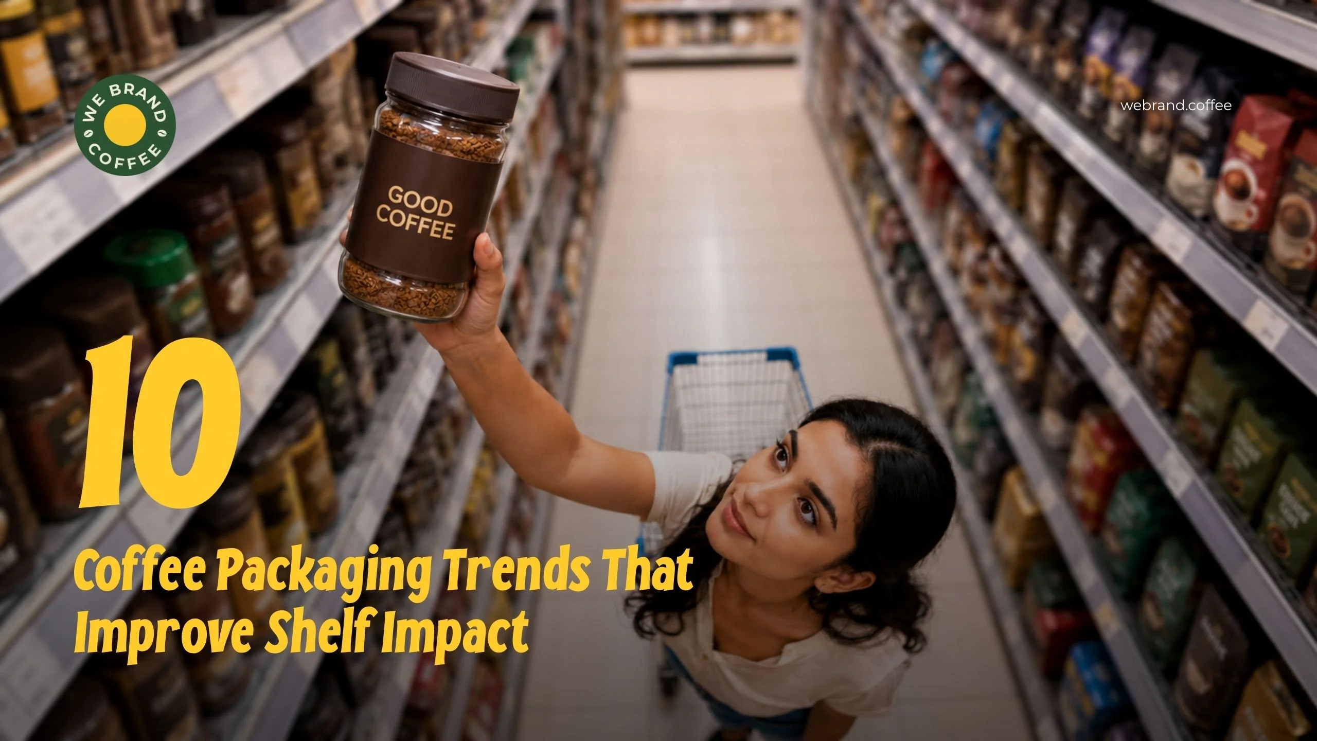
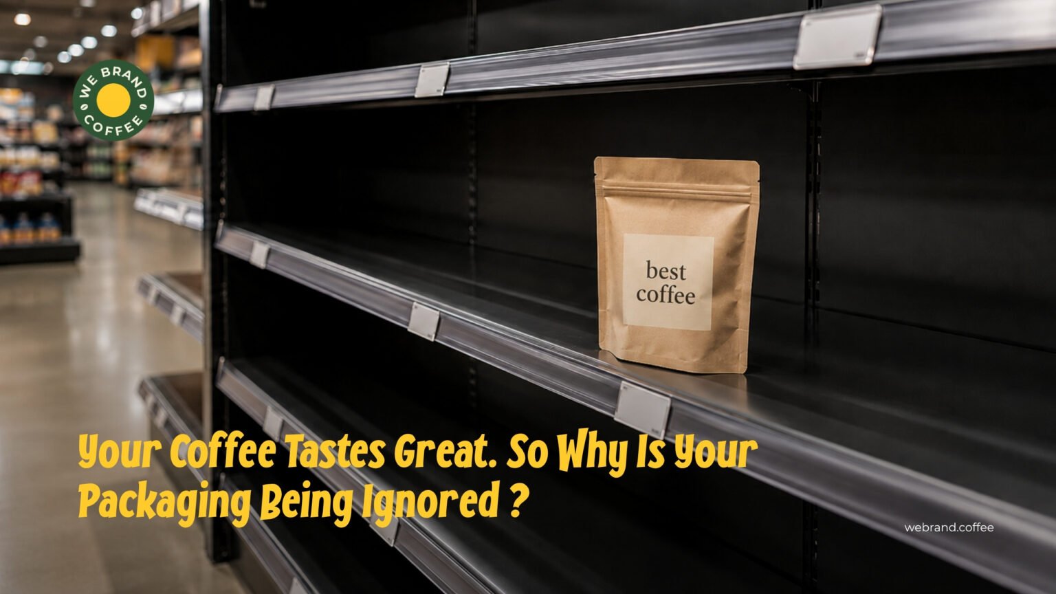
Coffee bags don’t just hold beans. They sell them. A shopper walking down a busy aisle scans shelves in seconds. If your bag doesn’t grab attention fast, it gets passed over, no matter how good the coffee tastes.
This is why coffee packaging design matters as much as roast quality. Great packaging stops the scroll (or the walk) and pulls the buyer in. Below are 10 packaging trends helping coffee brands stand out on crowded shelves today.
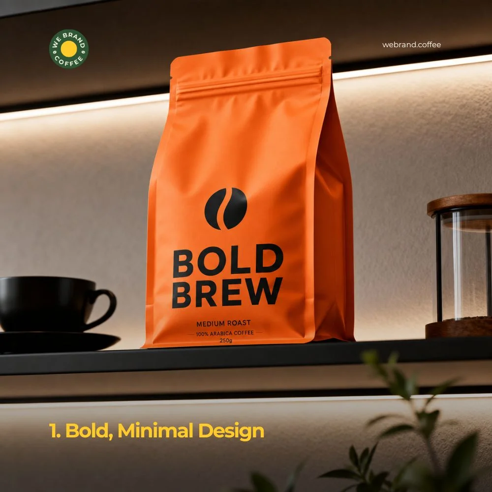
1. Bold, Minimal Design
Cluttered bags confuse the eye. Clean, minimal packaging design for coffee wins because it’s easy to read from a distance. Use one strong colour, one clear logo, and a short, punchy product name.
Minimalism doesn’t mean boring. It means focus. A single bright colour against a plain background can outshine a bag covered in text and tiny icons. When shoppers glance at a shelf, simple designs are the first thing they notice.
Brands using this style often pick one signature colour per blend. This makes flavours easy to spot and easy to remember. Next time a customer wants that “orange bag” dark roast, they’ll find it in seconds.
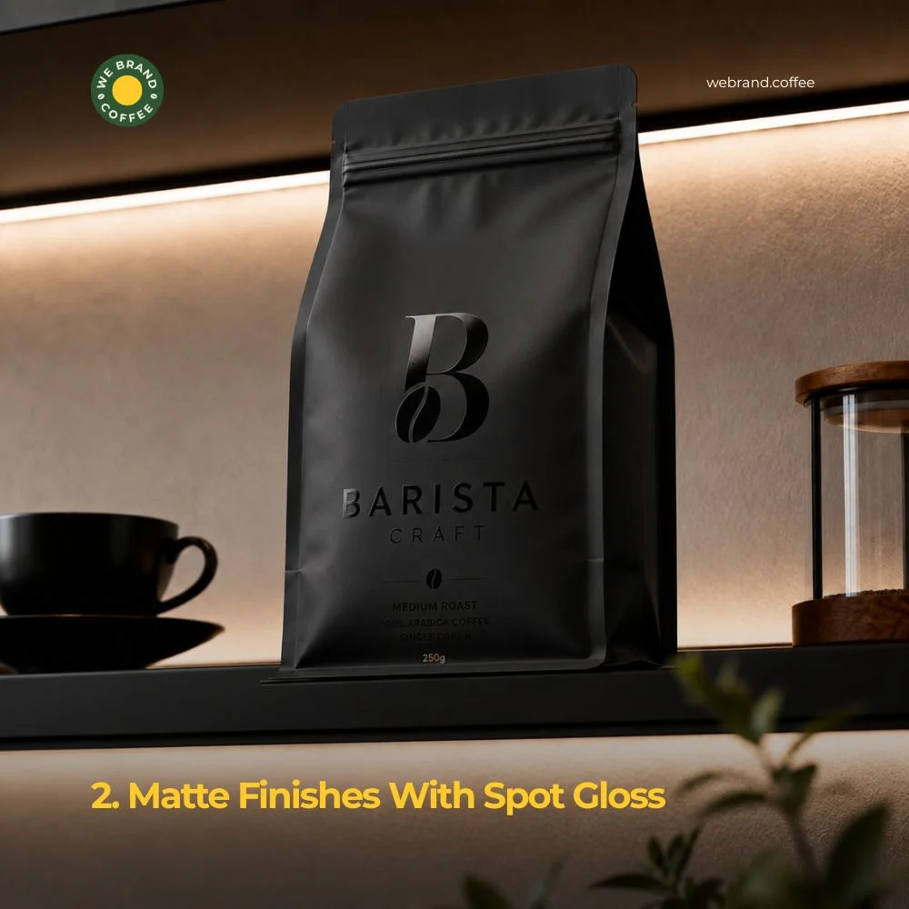
2. Matte Finishes With Spot Gloss
Matte texture feels premium. It’s soft to the touch and doesn’t reflect harsh light, which makes designs look cleaner under store lighting. Many brands now pair matte finishes with small glossy accents, a logo, an icon, or a border to create contrast.
This combo does two things. First, it adds visual depth without extra clutter. Second, it invites touch. People are drawn to pick up bags that feel different from the shiny plastic ones around them. That extra few seconds of contact often turns into a sale.
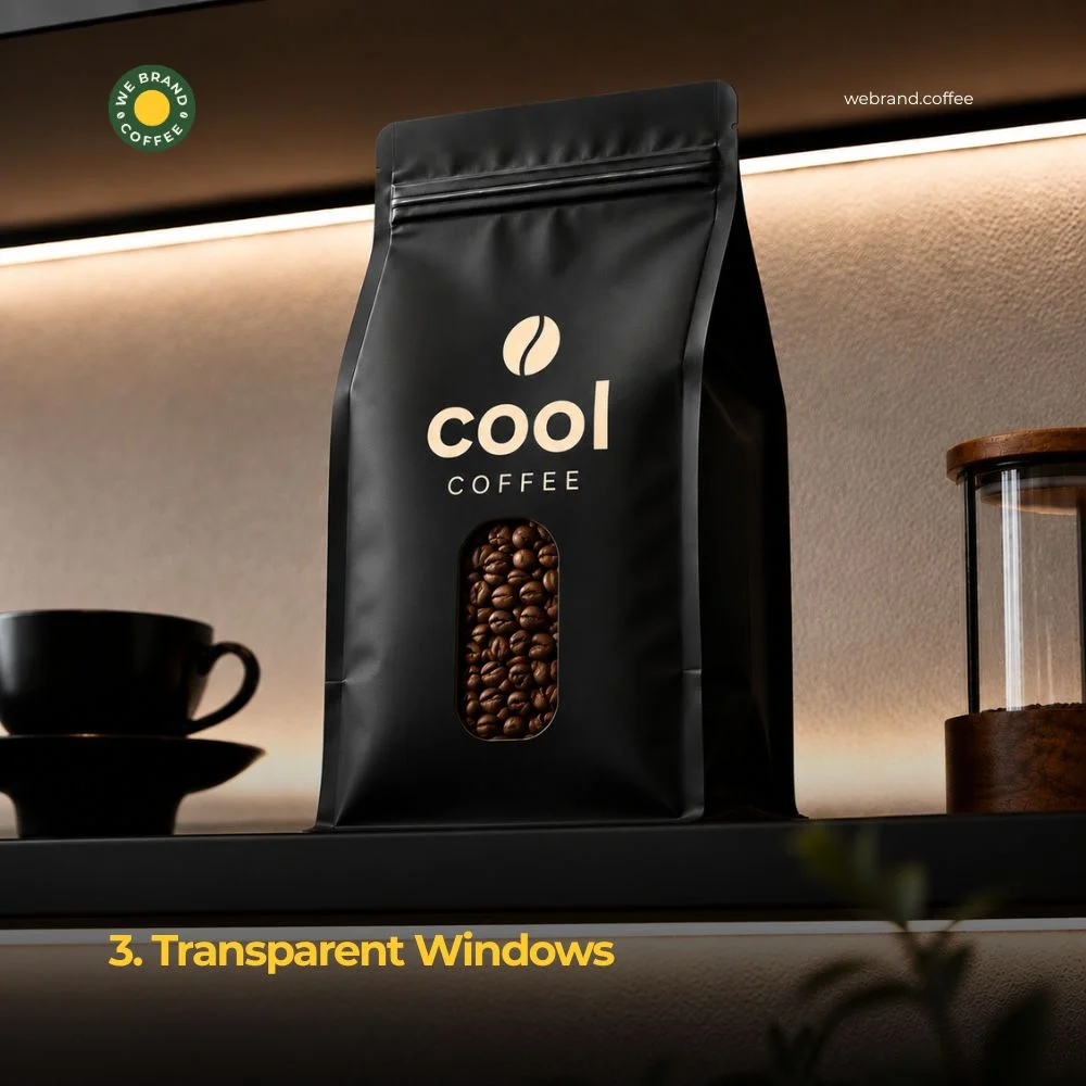
3. Transparent Windows
Seeing is believing. A small clear window cut into the bag lets shoppers view the actual beans inside. This builds trust instantly, especially for brands new to a shelf.
Whole bean coffee looks appealing; oily, dark, and fresh. A window shows that off without saying a word. It also signals honesty. Brands that hide the product behind solid coffee packaging can seem like they have something to cover up, even if that’s not true.
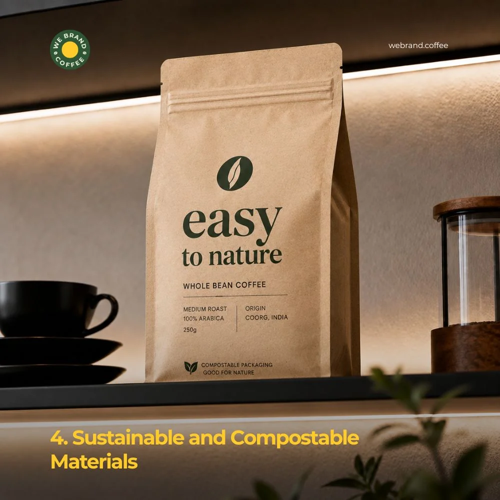
4. Sustainable and Compostable Materials
Shoppers care about the planet more than ever. Coffee packaging made from compostable film, recycled paper, or plant-based materials tells customers a brand shares their values.
This isn’t just a marketing angle. Many buyers now check bags for recycling symbols or compostable labels before adding coffee to their cart. Brands that skip this step risk looking outdated next to competitors who highlight eco-friendly choices in bold text.
Sustainable coffee packaging also often has a raw, natural look; think kraft paper, earthy tones, and simple typography. This style has become a trend of its own, signaling “clean” and “honest” even before a shopper reads the label.
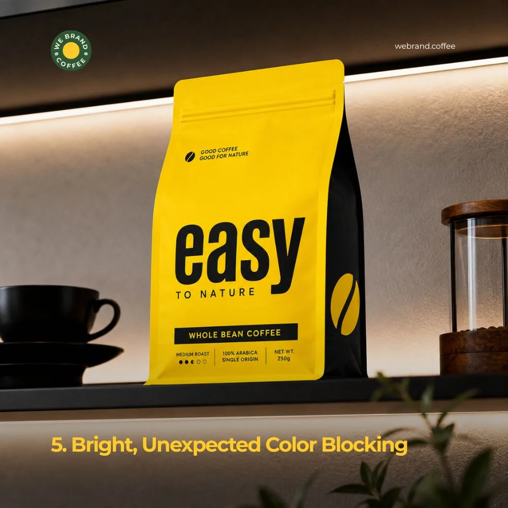
5. Bright, Unexpected Color Blocking
Coffee shelves have long relied on browns, blacks, and creams. New brands are breaking that pattern with bold, unexpected colours like hot pink, electric blue, sunshine yellow.
Why does this work? Contrast. When every bag around yours uses the same earthy palette, a bright block of colour instantly pulls the eye. It signals that the brand inside is different, fresh, and confident.
This trend works best when paired with strong typography. The colour grabs attention; the words seal the deal.
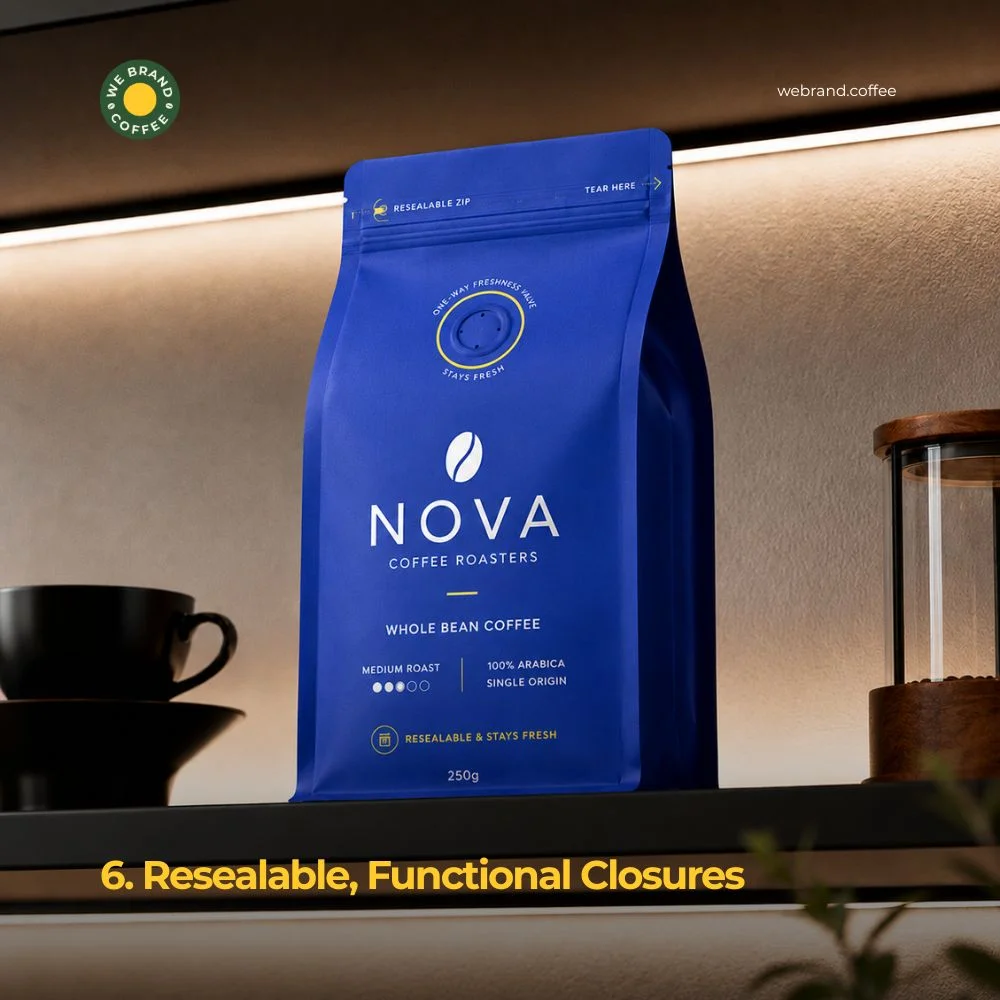
6. Resealable, Functional Closures
Shelf impact isn’t only about first impressions. It’s also about what happens after purchase. Bags with strong resealable zippers or valve closures keep coffee fresher longer, and customers notice.
A good closure becomes a selling point on its own. Some brands now print bold text like “Stays Fresh” or “Resealable Zip” right on the front. This turns a functional feature into a visual trust signal that boosts confidence at the shelf.
Freshness valves are those small circular vents that let gas escape without letting air in. These are also becoming a visible design element instead of a hidden detail. Some brands now frame the valve with a coloured ring or icon, turning a technical feature into part of the design story.
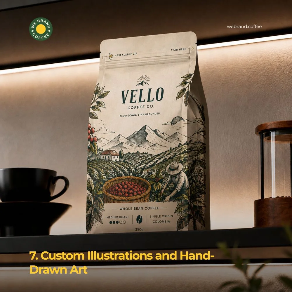
7. Custom Illustrations and Hand-Drawn Art
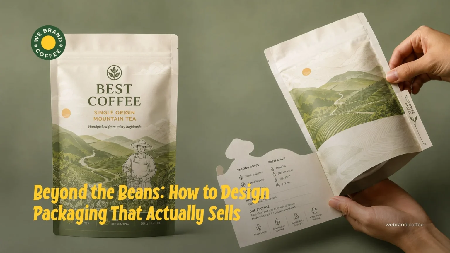
Photography can feel cold and generic. Illustration feels personal. More coffee brands are turning to custom, hand-drawn art like quirky characters, sketched landscapes, playful patterns that build a unique identity.
This trend works especially well for smaller, story-driven brands. A hand-drawn mountain range might hint at where the beans were grown. A quirky mascot might reflect the brand’s personality. Either way, illustration creates a memorable, one-of-a-kind look that’s hard for competitors to copy.
8. Strong Typography as the Hero
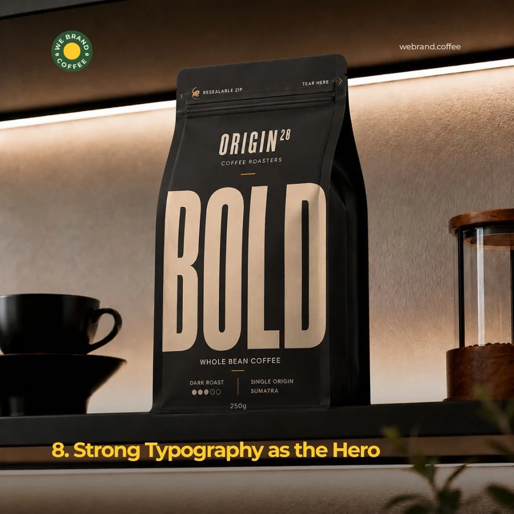
Sometimes the boldest design move is skipping images entirely. Typography-led packaging uses big, striking fonts as the main visual element. A short word like “BOLD,” “SMOOTH,” or “DARK” printed large across the bag can say more than a photo ever could.
This trend plays well with minimalism. Fewer elements mean the font itself becomes the star. Brands using this approach often pick a unique typeface that becomes part of their identity: something shoppers recognize even from a distance, without needing to read every word.
9. Matte Black and Gold Combinations
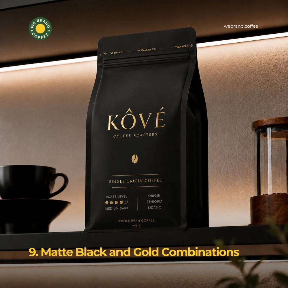
Luxury coffee brands are leaning into a classic pairing like matte black backgrounds with gold or metallic foil accents. This combo signals premium quality instantly before a shopper picks up the bag.
Gold foil catches light in a way flat printing can’t. Paired with black, it creates striking contrast that feels expensive and elegant. This trend works well for specialty or single-origin coffee brands looking to justify a higher price point through visual cues alone.
10. Storytelling Through Packaging Copy
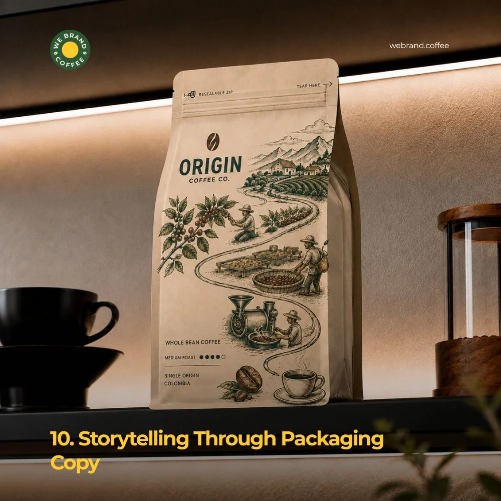
Design isn’t just visuals. The words on a bag matter too. More brands are using short, punchy copies to tell a story right on the front of the packaging, where the beans come from, how they’re roasted, or what makes the blend unique.
Instead of long paragraphs, successful brands use short phrases: “Grown in volcanic soil.” “Roasted in small batches.” “Traded fairly, every time.” These quick lines add personality and depth without slowing the shopper down. A great story, told in just a few words, can be the final push that turns a glance into a purchase.
Conclusion
Shelf impact comes down to one simple idea: give shoppers a reason to stop. Whether it’s a bold colour, a clear window, a sustainable material, or a clever line of text, every design choice should work toward that single goal.
The brands winning shelf space today aren’t always the ones with the biggest budgets. They’re the ones who understand their customer and design with intention. A clear identity, a confident colour palette, and a few smart functional details can do more than an expensive, overcrowded design ever could.
If you are rethinking your coffee packaging, start small. Pick one or two trends from this list that fit your brand’s personality. Test them. Watch how customers respond. Shelf impact isn’t about following every trend at once; it’s about choosing the right ones and executing them well.
Coffee is personal. Great packaging coffee design respects that. It tells a quick, honest story, builds trust at a glance, and gives your beans the best possible chance to be picked up, taken home, and brewed