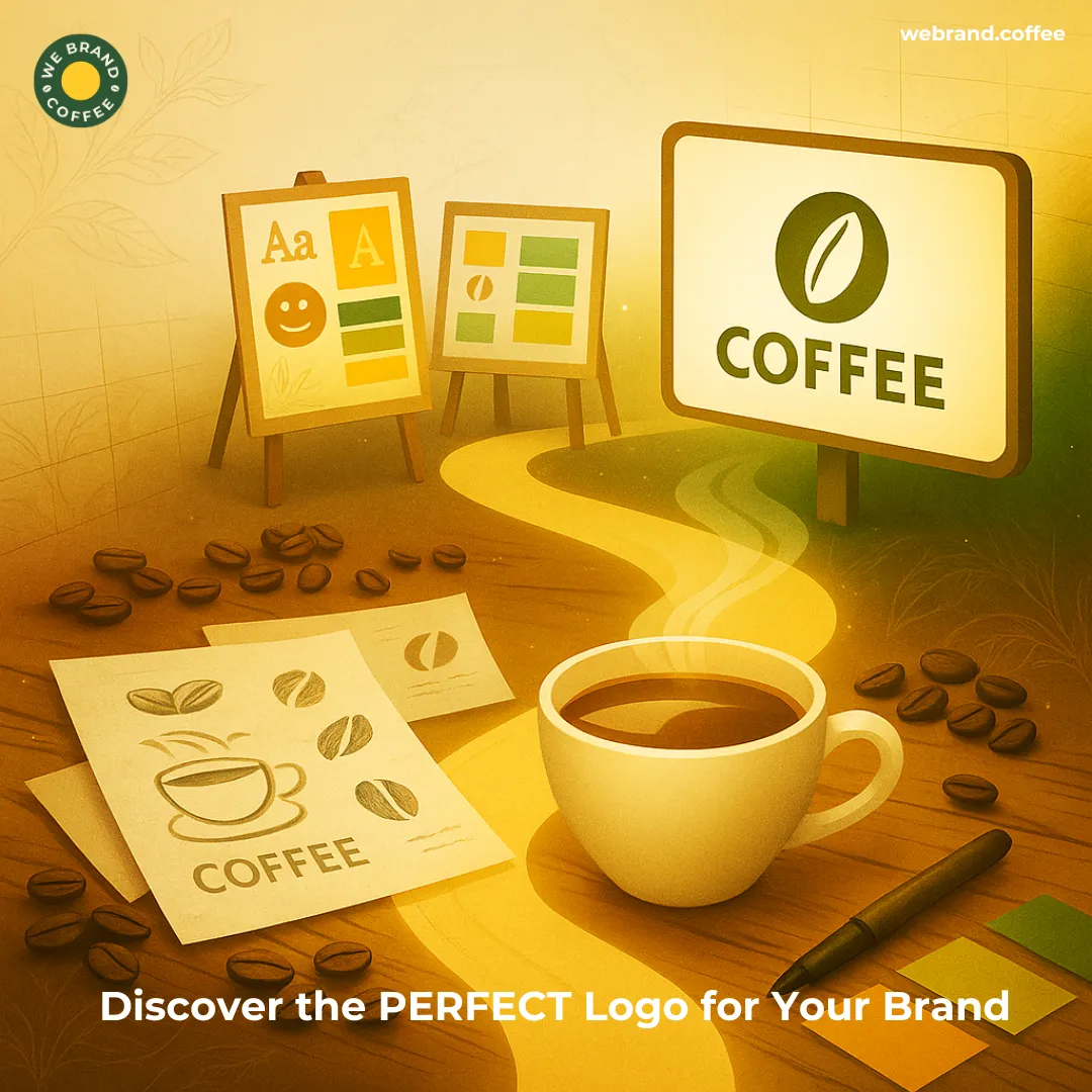
Step-by-Step Guide to Designing a Coffee Brand Logo in 2026
Recent Posts
Share this article:
With almost a decade of experience, we have learned that coffee brand logos hold the potential to sell your beans before your consumers even smell them. Whether you are launching a boutique roastery, an artisanal café, or an e-commerce coffee brand, a well-crafted logo stands out as the face of your business.
That pretty graphic is the first impression your coffee brand makes and often acts as a deciding factor in whether someone becomes a loyal customer of your coffee brand or just walks to the cafe next door. Designing a perfect coffee brand logo is all about narrating your coffee brand’s story through rich, warm, and layered imagery.
Now, designing a coffee brand logo is not just slapping a steaming mug on a badge and calling it a day. Crafting the perfect coffee brand logo is about the strategic blend of coffee branding agency insights, design principles, and digital adaptability.
This blog aims to break down how you can design a perfect coffee brand logo that defines your brand identity by choosing the right colors and typography, ultimately creating a coffee brand logo that leaves a lasting visual impression.
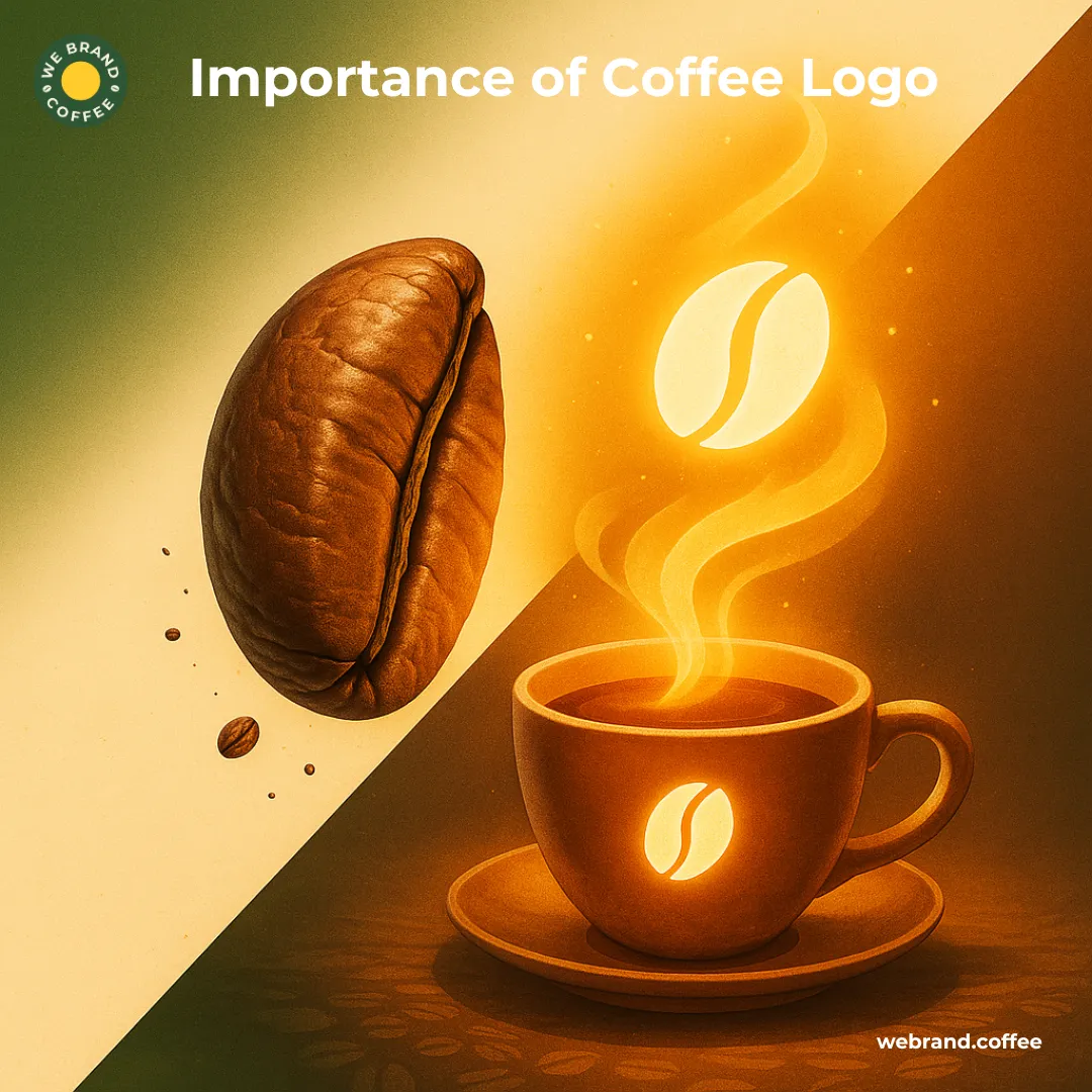
What is the secret ingredient of a great coffee brand logo?

While your signature brew might get everyone to keep sipping, the real magic of beans lies between the brew, bean, and brand story reflected in your coffee brand logo. To not keep the suspense for long, the secret ingredient of a great coffee brand logo is not just sleek lines or clever symbols, but rather, it is the emotions.
Why? The best coffee logo design evokes a feeling of warmth, comfort, energy, and sophistication. Irrespective of the style of your coffee brand, be it based on the clean minimalism of a modern mark or carrying the rustic vibe of a hand-stamped seal, your coffee brand logo should hold the potential to trigger an emotional connection in consumers within seconds.
The reason is the nature of coffee consumers, which is connected with the feelings of coziness, craft, and community-driven.
In addition to the emotional narrative of your coffee brand logo, another ingredient that makes your coffee brand logo stand out is authenticity. Again, the reason lies in today’s coffee consumers who are not just buying your coffee, but rather, they are buying your coffee brand story, values, and your vibe. Is your coffee brand a farm-to-cup, fair-trade, or focused on third-wave craftsmanship? The secret ingredient of your coffee brand logo should reflect what you stand for.
How this makes the perfect coffee brand logo design for your brand is that it means staying true to your brand’s origin, mission, and tone, alongside letting the authenticity of your beans shine through every curve and color of your coffee brand logo.
Moreover, consistent branding in your coffee brand logo not only builds recognition, but also builds a presence of flexible application which can be easily adaptable in multiple formats, such as wordmarks, icons, vertical, and horizontal versions.
How to find your coffee brand logo design style?
Designing your perfect coffee logo design begins with finding the true essence of your coffee brand’s personality. Be it your coffee brand’s flavor, mood, and voice, embodying the same narrative of your coffee brand in your coffee logo design points the craft in the right stylistic direction.
Finding your coffee brand logo style is just like roasting the perfect batch of beans with the right plantation type, timing, and personality. But how do you find the ultimate style for your coffee brand logo design that would not only attract your ideal audience but also stay behind the true narrative of your brand’s language?
Here are a few tips on how you can find your coffee brand logo design style:
- What is your coffee brand’s personality?
The best way to find your coffee brand logo’s style is to begin with the persona of your brand. Is it bold and elegant, handcrafted and organic, or minimalist and upscale? Why this helps in finding a style for your coffee brand logo is that you can decide if you want to go for modern typography and high-contrast colors, or an approach with clean lines and subtle detailing will do the trick. Identifying this personality trait of yours can help define your brand and translate it into a visual language.
- What is your consumer looking for?
While finding the style for your coffee brand logo, the primary thing to consider is your customers first. We understand that the coffee brand is your soul, but the truth is that your logo is for your customers. So, you have to put yourself in their shoes. Hence, before designing your coffee brand logo, ask if your consumers are young professionals grabbing lattes on the go or if they are mindful slow-sippers who care about sourcing and story.
The design style you choose for your coffee brand logo should resonate with the values and taste of your audience, as it would attract the right crowd and not just look trendy.
- What is popular in the coffee industry?
We are not asking you to compromise on your originality; however, exploring popular styles in the coffee market can help you narrow your creative direction for designing your coffee brand logo. Some dominant styles in coffee brand logo designing today are vintage or retro logo design, which not only evokes tradition but also craftsmanship and nostalgia. Another coffee brand logo design that is popular in the market today is minimalistic, clean, timeless, and perfect for upscale modern brands. Apart from this, hand-drawn, organic, bold typographic, and icon-driven coffee brand logo designs are something that has been popular across the coffee industry lately. Knowing what is popular in the coffee industry is to take inspiration, but never imitate. Blend the trends with your brand’s DNA and create something authentic for yours.
- What experiments are you doing with moodboards?

Crafting a coffee brand logo is nothing less than a journey. This journey of designing your coffee brand logo begins with a visual mood board and ends with gathering coffee packaging designs that you admire, fonts that fit your tone, colour palettes that reflect your mood, and a coffee brand logo that other industries would love.
Spending the maximum time on your moodboard will help you create style tiles and see how things work together in context.
- What touchpoints is your coffee brand logo style scaling across?
One of the best methods to find the style for your coffee brand logo is to test it in the context of consistency across touchpoints. This is where questions like Will the coffee brand logo design look good on a paper cup and a billboard, social media, eCommerce website, and other digital formats? Or not. This is essential because the best coffee brand logo design is not attractive; rather, it is functional with your chosen aesthetics scaling, flexing, and shining whenever your brand lives.
Finding your coffee brand logo style is like finding a piece of your entire brand identity, which includes every design element from tone of voice, imagery, packaging, to web presence. While your coffee brand logo design should support a cohesive brand ecosystem, it should also not clash with your brand tone; otherwise, your brand message will get muddled. Hence, to find the true personality of your coffee brand, think long-term and choose a logo style that can grow with your coffee brand and not just what’s trendy this year.
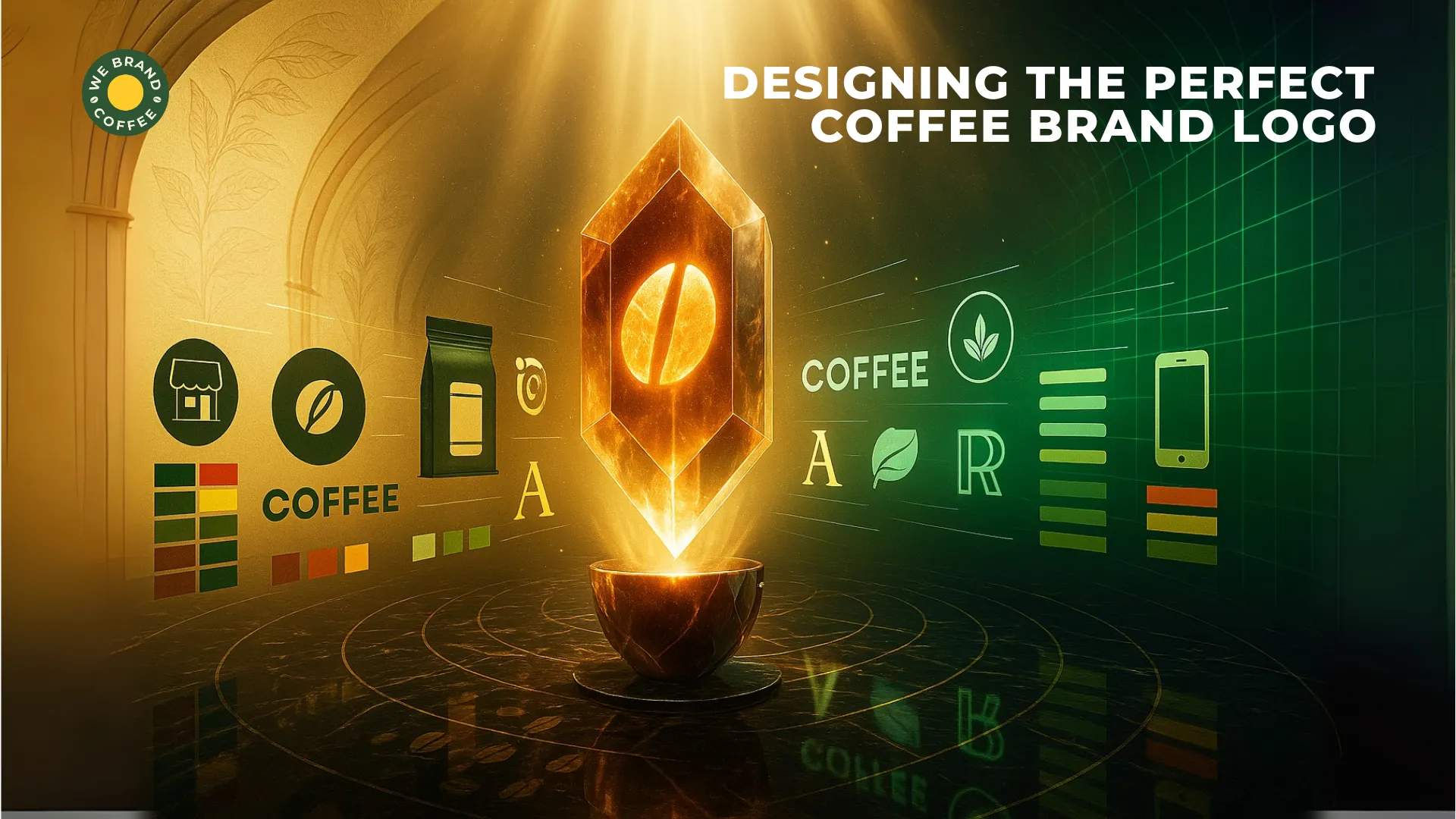
Color, Fonts & Icons: How the right design elements can make or break your coffee brand logo?
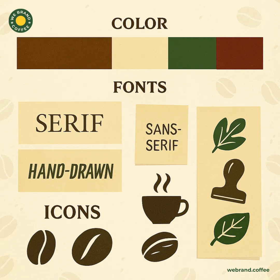
Once you have found the true personality of your coffee brand, what is left is conveying the same brand identity through the coffee brand logo design elements, such as color, fonts, icons, and many more. Choosing the right logo design elements not only helps in reflecting brand identity but also your brand values and quality. Here’s how choosing the right design elements can make or break your coffee brand logo:
- Color
In terms of coffee brand logo design, colour acts as the emotional connector, as it not only sets the mood for your brand but also generates emotional responses. By using colour, you can make your brand associate with vibes like warmth, comfort, energy, and luxury. What colours work for coffee brand logo design are brown, black, cream, beige, purple, maroon, red, orange, and what does not work for coffee brand logo design is bright neon colors or muted pastels that feel off-brand unless you are targeting a niche audience who are trendy, youth-focused, and an iced coffee line.
- Fonts
If colour is the emotional connector of your coffee brand logo design, then fonts or typography are the personality of your coffee brand logo design. This is because fonts hold the capacity to visually communicate the tone and character of your coffee brand logo. So whether your coffee brand wants to reflect rustic charm or modern minimalism, choosing the correct font type that reflects your coffee brand logo personality is essential to designing the perfect coffee brand logo. Now, for coffee brand logo typography, what works is handwritten typography or styles that evoke a sense of artisanal, crafted vibes, which are great for local cafes. Apart from that, you can also try designing your coffee brand around serif fonts, sans-serif fonts, and typography to achieve the ideal visual for your coffee brand. Having said that, you should avoid overused or unreadable fonts such as Comic Sans or ultra-thin scripts or too many font styles in one logo, as it would just create confusion and clutter.
- Icons and imagery
For designing the coffee logo, the brand icons and imagery play an important role as they hold the potential to reflect the right meaning, brand relevance, and instant recognizability. Such popular icon ideas that are surely overused, but when designed to reflect your brand, work well, are coffee beans or cups, steam lines, mountains, farms, hands, or tools. The idea is to use icons and imagery that would suggest warmth, freshness, craftsmanship, care, origin, quality, and sustainability. However, you can avoid generic clip arts or icons that do not hold any relevance to your brand story. This would only overly complicate your graphics, which would not scale well and also lose details when printed in small sizes.
The right coffee brand logo design for your brand is the one that is crafted by aligning all three design elements. When you strategically combine all the essential elements of coffee brand logo design, you end up reflecting your brand values, such as organic, premium, and trendy, as well as connecting emotionally with your target audience, along with standing out in a crowded marketplace.
Can you brew up a great coffee brand logo online? Let’s find out.
Being in the coffee brand logo designing business exclusively, we are aware that crafting a logo today is as easy as asking AI to generate one. But will generating a coffee brand logo get your brew into an individual’s daily life? No doubt, the digital world is full of intuitive, cost-effective logo creation tools. Be it platforms like Canva, Looka, Hatchful, and even LogoMakr, they all have made logo design more accessible than ever today.
While the idea of making your coffee brand logo design online does put you at an advantage stage, be it with the speed, affordability, templates, or control, it does seem like the best option for the coffee entrepreneurs on a budget.
But being in the business for more than 10 years, WeBrandCoffee sees that the long-term disadvantage of generating the coffee brand logo has on your brand is more damaging than investing in a professional coffee brand logo designing agency because, at the end of the day, a great coffee brand logo is still more than just dragging and dropping a coffee cup icon.
The impacts your brand will go through with an online-generated coffee brand logo are:
- Lack of originality
The foremost issue that you will face is marking a differentiating factor for your coffee brand, as most AI-generated coffee brand logos lack originality. This happens because the algorithm relies on pre-made templates and stock icons. As a result, your coffee brand logo would look generic and similar to other coffee brands, which will make it hard for your coffee brand to stand out in the already very saturated coffee market.
- Limited customization
A major complication with online-generated coffee brand logos is the limited customization. While online tools have the potential to generate any imagination of yours, they hold the disadvantage of truly bringing it to life, and after a point, the customization prompts end up looking monotonous without any striking difference. Making a coffee brand logo restricts customization factors such as font options, color combinations, icon placements, and advanced graphic edits. Hence, when you have a specific creative vision to reflect in your coffee brand logo, then these limitations can be frustrating and limiting.
- No deep brand strategy
While expert coffee brand logo makers focus on design, what AI-generated coffee brand logo design lacks is understanding your brand values or audience deeply to an extent that would translate your origin story into visual symbolism. Hence, crafting a coffee logo design that supports long-term brand storytelling and works strategically as well requires the expert lens of professional coffee brand logo design.
- Scalability and print issues
If you are planning to design your coffee brand logo online, a consistent issue that your brand would face over time, again and again, is scalability and print. This is because most AI coffee brand logo design tools do not provide high-resolution or vector files, such as SVG and EPS. When you lack access to such files, your logo ends up getting pixelated when printed on signs, packaging, or even merchandise. This would end up making your coffee brand logo not easily adaptable across different media.
- Copyright and licensing concerns
A major issue that you are bound to face and something that most people miss is the legal ones. When generated online, your coffee brand logo will not get licensed for commercial use and might cause legal issues when you use it on your products or packaging. Imagine building your coffee brand from the beans and only receiving a cease and desist for your coffee brand logo.
In addition to these, creating a coffee brand logo design online does look like a great starting point to get your brand off to a kickstart, but remember that it is not always the final solution. Being mindful of the limitations and putting in the human creative input that comes from years of in-field experience, artistic intuition, market trend knowledge, and emotional storytelling, which a DIY or AI tool can never replicate, your coffee brand logo will end up having a missing element of that expert feedback and creative collaboration.
Logo litmus test: How to know if yours is making the right impression or not?
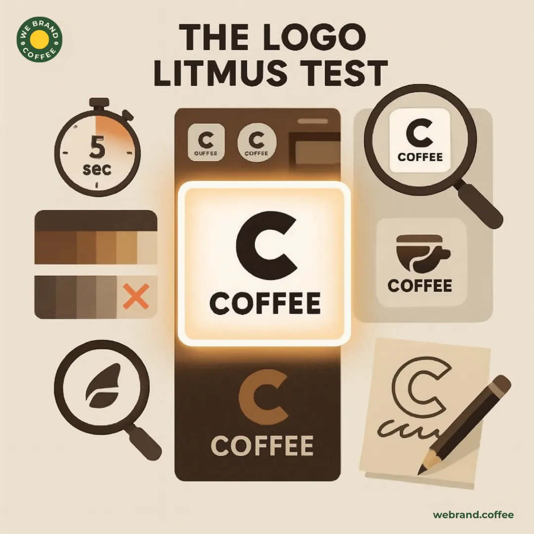
At WeBrandCoffee, we have developed a systematic, professional, and relevant logo testing metric called the Logo Litmus Test. At our coffee brand logo designing agency, each of your crafted coffee brand logos goes through this set of metrics. This is done by passing our designed coffee brand logo through a checklist of essential questions and tests to estimate if your coffee brand logo will end up making the right impression or not.
Here’s us exposing ourselves and sharing the insight on the questions that would make you estimate if your coffee brand logo design will work or not for your brand:
- Is the coffee brand logo recognizable within 5 seconds or not? How does WeBrandCoffee test? We show the coffee brand logo to a stranger for 5 seconds and then ask what they remember. The maximum element they remember the best is the coffee brand logo.
- Does your coffee brand logo design reflect your brand personality, and does it visually match your brand personality or not?
- Will the coffee brand logo design work across all sizes and platforms or not? Does the coffee brand logo look good on a favicon, Instagram profile pic, mobile screen icon, or website header? Or is the coffee brand logo still readable and clear at 100px wide as well, or not? A fail sign is your coffee brand logo becoming a blurry blob when shrunk.
- Does your coffee brand logo use colours or not? The concern should be the colour combination of your coffee brand logo, feeling inviting, premium, or refreshing; a palette that is distinct and true to your brand. Clashing colors and trendy palettes that do not match your identity are red flags.
In addition to these, the other questions that make the list of WeBrandCoffee’s Logo Litmus Test are about the elements of unique visual twists that would set your coffee brand logo apart. A pro tip from the WeBrandCoffee team is to show your logo to 5 people and ask them 24 hours later to describe it, sketch it from memory, and see if your coffee brand logo is working or not for your coffee brand.
Conclusion
In conclusion, designing the perfect coffee brand logo is all about achieving the right balance of emotion, storytelling, design, and strategy through the various elements of the coffee brand logo. Designing a coffee brand logo is not about having the trendiest look as all the visuals; rather, it is about reflecting who you truly are as a coffee brand.
Hence, when crafted with intention and authenticity, your coffee brand logo will become more than just a symbol, but rather become an ecommerce banner for your coffee brand that would make your audience feel something that is rooted in your mission, style of precision, and ultimately scale with adaptability.
So whether you are brewing your coffee for bold thinkers, slow sippers, or everyday grinders, your coffee brand logo should speak their language before your coffee even hits their cup. All in all, you need a professionally crafted, strategic, emotionally charged coffee brand logo that brews your brand loyalty.
Recent Posts
Related Posts