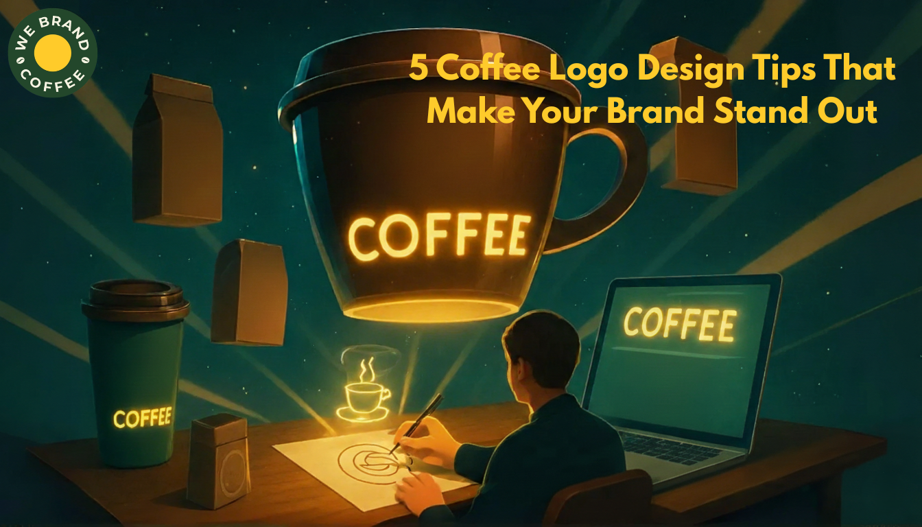
5 Coffee Logo Design Tips That Make Your Brand Stand Out
Recent Posts
Share this article:
As a coffee branding agency, we have this habit of relating elements like the logo design of coffee branding to coffee itself. Similarly, when it comes to disclosing the best logo design tips for coffee entrepreneurs, finding a relation with brew viscosity, so, as a coffee entrepreneur, your coffee brand logo design can drip as anything between strong, bold, weak, or watered down.
Nonetheless, the roast level and origin of your coffee are not enough to get your coffee brand the gravity it needs to sustain the overcrowded coffee market; it is in the logo design.
The right concentration of logo design is the one that grips your audience from the first glance, from the first sip and stays with them long after the coffee cup is empty and does not blend into the noise of a coffee marketplace where minimalist packaging, origin stories, and artisanal is painted over every logo design.
Our time at WeBrandCoffee crafting coffee logo design for founders who wanted their coffee brand to be shown through their logo design for who they are made us know that not alone coffee has the role of feeling like an early-morning ritual, an aesthetic escape, or a punchy downtown espresso shot but so does a logo design.
Let us have a coffee over while discussing the best logo design tips when you are branding a brand in a $100 billion global industry!
Why is a strategic logo design a key asset for coffee startups?
What most coffee startups miss while looking for an agency to craft that logo design that resonates with their coffee brand is having their primary focus on the logo design expertise. But would you believe if we said that an apt logo design strategy always leads to creativity? Not even if a decade-old coffee branding expert says it?
Okay, you are an entrepreneur and want the logo design narratives to be well-backed. So be it. Now think about the moment you walked past a cafe, scrolled past a coffee ad online, or scanned a supermarket shelf for single-origin coffee beans. None of the above activities included you tasting the roast or smelling the aroma, but noticing the logo design was sure one, and the ones you did not notice are not a bad logo design, but a poor logo design strategy.
The same strategy is what differs WeBrandCoffee’s logo design from others. For achieving the right logo design that becomes your coffee brand handshake, your story, and your vision, a strategic logo design is what becomes a potent shot of your coffee brand perception.
Why a strategic logo design approach becomes a key asset is that the logo design holds the potential to convey your coffee brand’s ethos, vibe, and your brand mission, and creates an emotional response with your customers in a market that is buzzing with minimalism.
Our strategic approaches for achieving the right logo design for your coffee brand are:
- Culturally aware but visually distinct logo design
- Scalable logo design across packaging, merch, signage, and digital platforms
- Reflective of your flavor philosophy, sourcing values, and customer vibe
- Logo design crafted with the future in mind, and not just the launch
But what does this strategically thought-out logo design bring differently to your coffee startup? Well, a logo design that is not only creatively backed but strategically as well, the logo design should hold the potential of instant brand recognition across physical and digital platforms that commands shelf presence of boutique cafes as well as whole foods.
Carefully balanced, deeply considered, and made to leave a lasting impression is the sign of a strong, strategic logo design that not only communicates clarity but also crafts a quiet confidence that makes your audience keep coming back for more.
Top logo design tips every coffee entrepreneur should know
We have seen it time and again, founders who started with a logo design rooted in strategy have always had a better position in evolving, rebranding, or capturing an investor’s confidence in this over-brewed market. However, alongside a basic strategy for logo design, there are a few more tips that every coffee entrepreneur should know before moving on with a logo design craft.
Here are the top logo design tips every coffee entrepreneur must know before moving on with their logo design!
- Crafting logo design for meaning and not looks
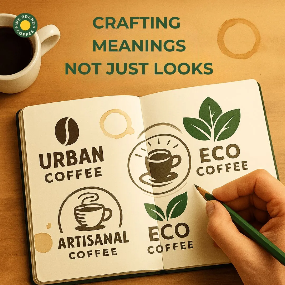
Believe it or not, logo design is less about the looks and more about the meaning. Rather, you can say that a logo design looks good when the meaning aligns. Bold, urban, earthy, ethical, vintage, or slow-roasted; your logo design should reflect who you are as a brand, its soul, and not just the latest design fad.
- Simplicity is strength in a logo design.
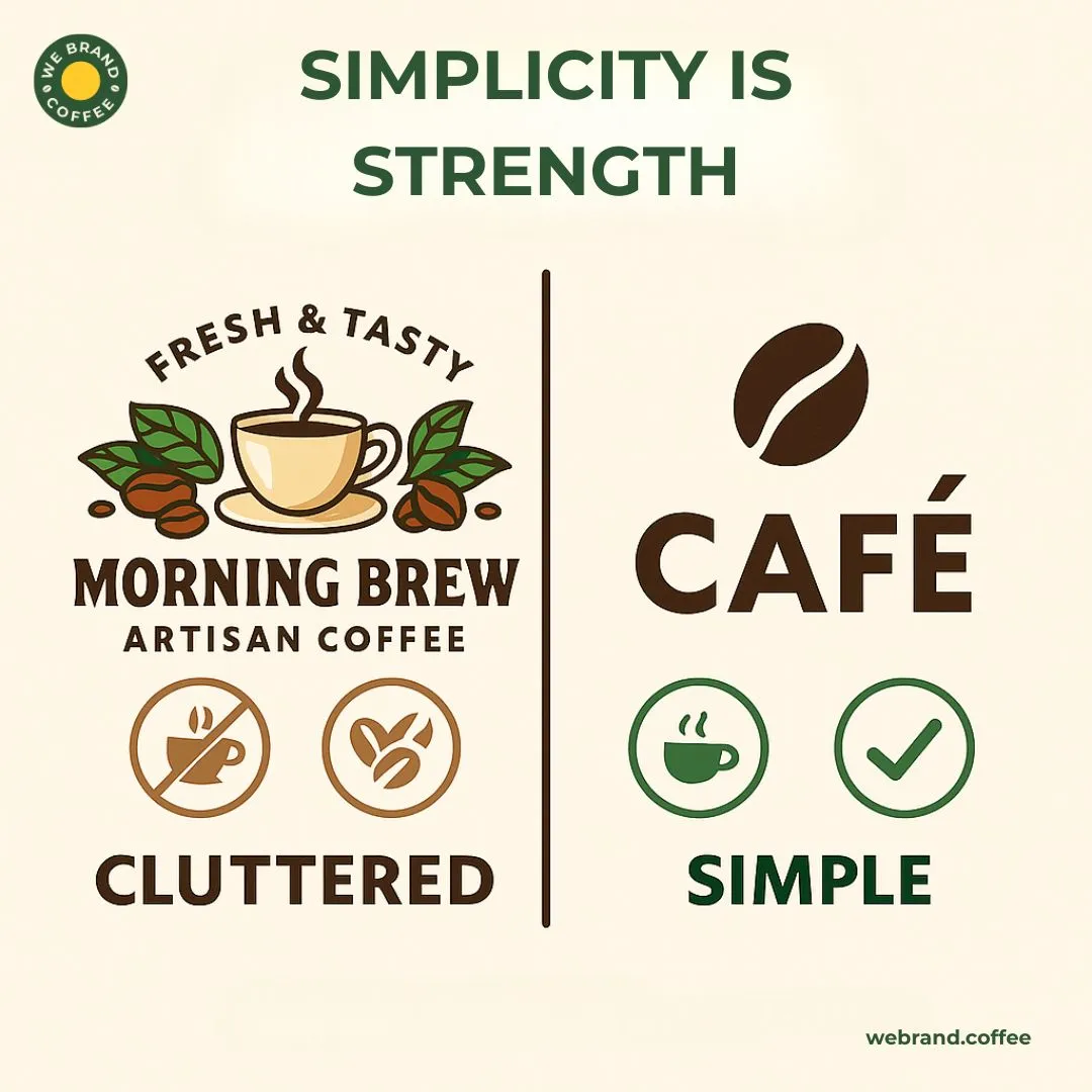
A common wrong approach for logo design that most coffee entrepreneurs take when it comes to their brand’s logo design is overcomplicating the process with too many details, colours, and fonts. However, the best coffee logo design is the one that is clean, memorable, and scalable.
- Thinking beyond a cafe window for a logo design
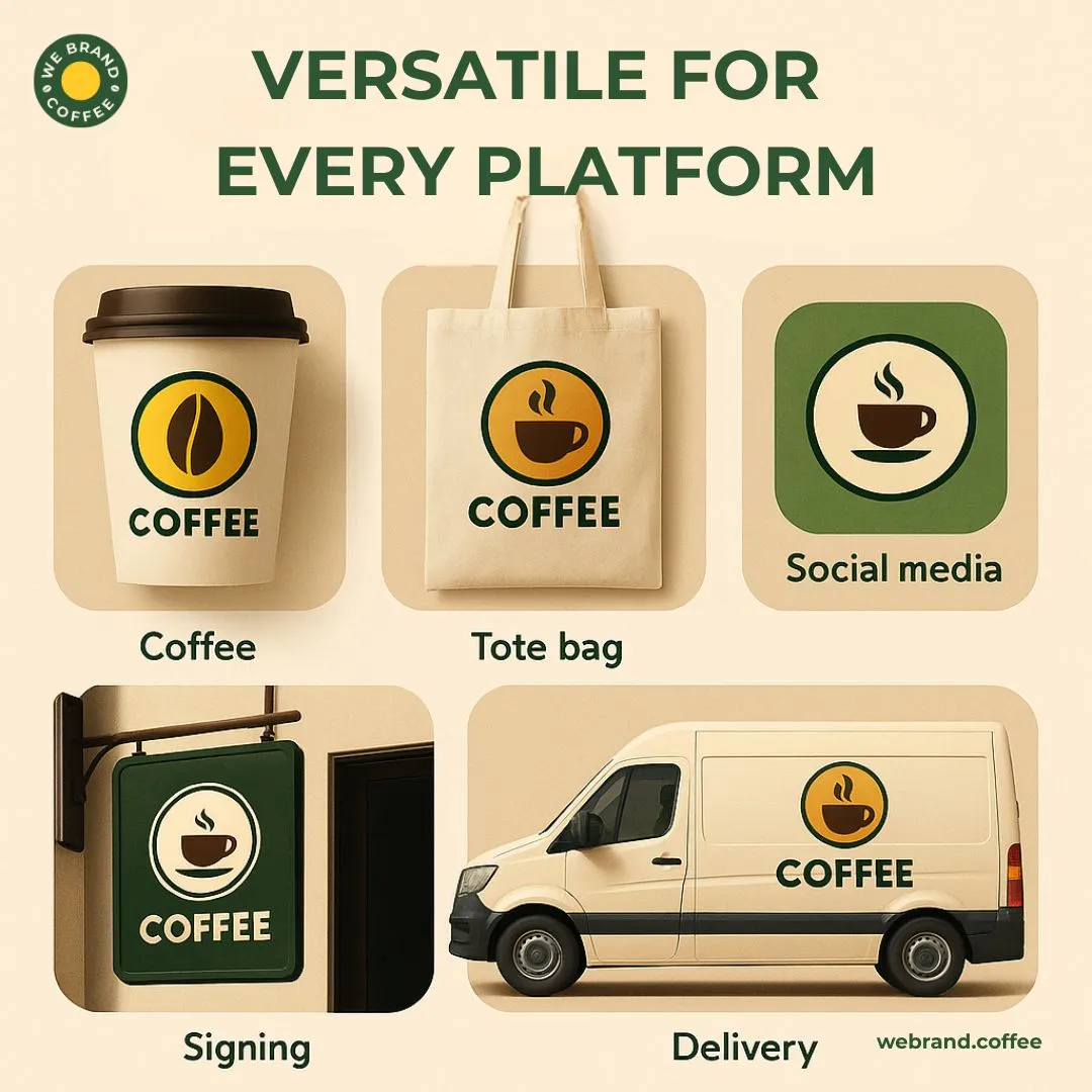
One tip that cannot be missed while crafting a logo design for coffee brands is the fact that it should be versatile for all environments. Bags, cups, merch, social media, newsletter, wholesale catalogs, or maybe even a delivery van, your logo design should be crafted well to live everywhere. A simple solution to effortlessly achieve versatility in your logo design is by building multiple logo design versions, from full, icon-only, wordmark, to stacked.
- Making the logo design ownable
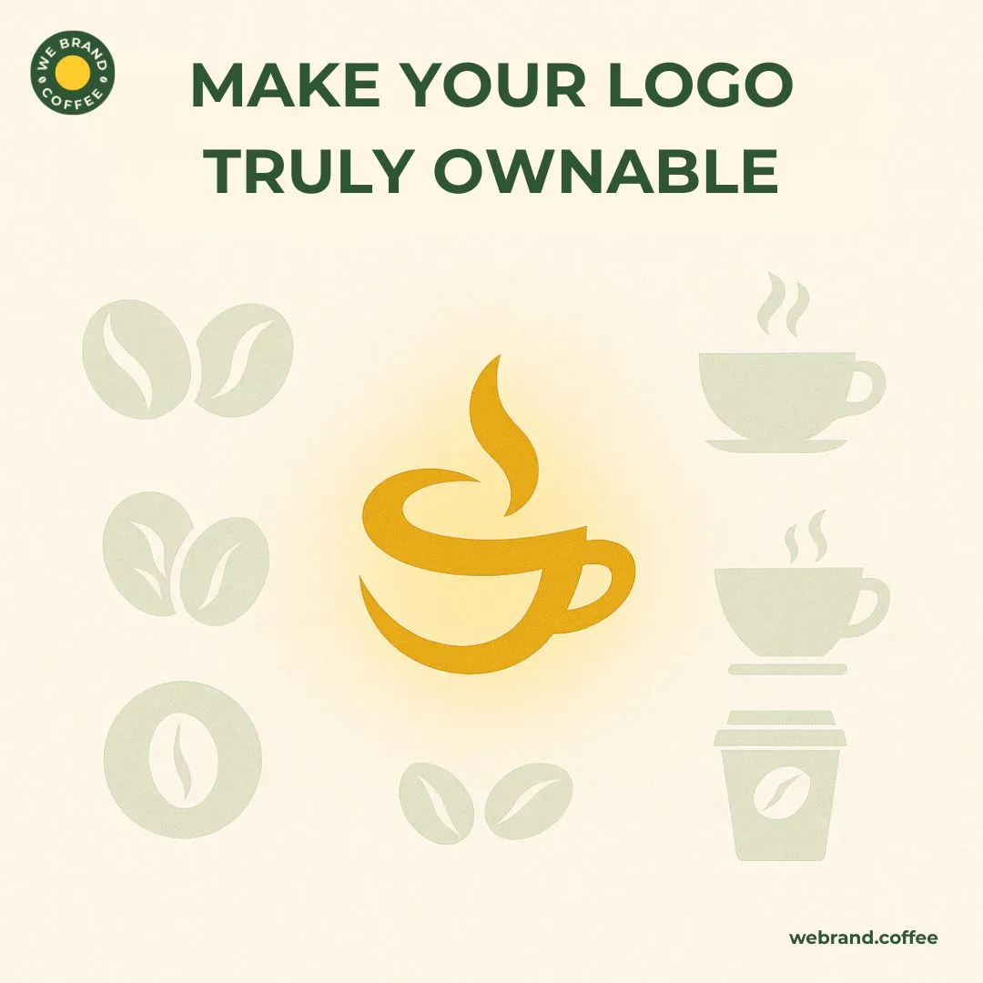
With years of experience in coffee branding, designers at WeBrandCoffee have moved on from generic beans, steam swirls, or clip-art coffee cups for a coffee brand logo design. This tip for logo design is derived from the same in-house approach, of not taking these generic elements for your logo design unless you are putting a fresh spin on them. Just like your signature brew, your brand’s logo design should hold the undertones of originality with custom logo design elements.
- Intentional color usage in logo design
Color holds a primary role in a logo design. Not because logo design acts as an emotional trigger, but because it can help you position your logo design as playful or premium, as per requirement. For example, earthy tones suggest sustainability, deep browns and blacks hint at boldness. Hence, for a logo design, our tip is to always align your coffee’s experience with the logo design palette and not move ahead with what’s just trendy.
- Play with typography in logo design.
Remember how we spoke about strategy-backed logo design? That is where typography steps in to narrate your coffee origin story through a logo design and target the audience who understands your brew’s undertones. Sleep sans-serif for the modern and minimalistic logo design reach, or vintage scripts for artisanal and heritage-driven logo design feels. Choosing a type that reflects your brand personality helps your logo design communicate to more than just your salesperson. A bonus tip for the best logo design is to not use more than two fonts and follow a path of unified and non-confusing design.
- Instant recognition of the logo design
The whole point of having a logo design is to move above the generic and be recognised instantly. Our tip with a logo design is to design for being identifiable at a glance while not asking for attention, rather commanding the audience’s attention. How to achieve such a logo design? Test your logo design by shrinking it to the size of your profile picture, and if it is still recognizable, then bingo!
- Future-proof the logo design.
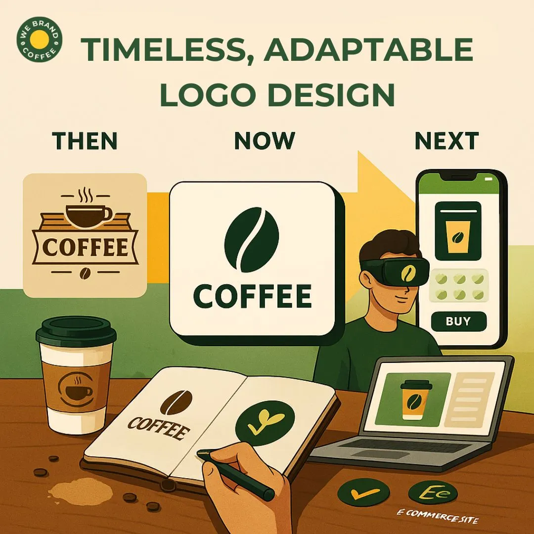
Trust us, we have seen endless coffee brand entrepreneurs come up to us with trends as their logo design reference. And every time we have had the same pitch in taking them out of this perception, which is nothing but the words “ trends fade, and once it does, so will your logo design”. See, you need a logo design that evolves with your coffee brand and does not fall flat with the losing interest of netizens. So make sure your logo design feels timeless and adaptable to potential growth, such as new product lines or rebrands, a logo design that has depth like your brew and does not expire like day-old creme.
In addition to these logo design tips, a major perspective to be consistent throughout the logo design process is creating a visual system in the logo design. You need to remember that your logo design is just the starting point, so pairing the logo design with the colors, textures, typography, icons, and patterns that align cohesively with your coffee brand’s vision and mission. Hence, working with professional coffee logo design experts who not only understand the notes of each coffee bean but also have the ability to bring that tone out on your logo design in the form of emotion and sensory appeal.
What makes a great logo design for coffee brands?
There is nothing extraordinary in giving logo design tips when you have crafted logo designs for multiple coffee brands; the true essence is in discussing the design elements of a logo design that some of the most experienced coffee branding designers use to make your logo design unique and relevant in this saturated market.
But why do we need to discuss these logo design elements that make a logo design great? The answer lies in the fact that these logo design elements are beyond aesthetic choices; rather, these logo design elements are the strategic tools of some of the best logo design artists in the world who shape emotion and culture into a commercial impact for your coffee brand logo design.
Let us see what such logo design elements are!
- Iconography and symbolism of logo design
A logo design is essentially a form of narrating your coffee brand’s story. So, a great coffee logo design is the one that acts as a symbol to root your coffee brand in a sense of craft and culture. Such logo design visual elements help create fast brand recall. We all know the popular and overused icons in logo design, such as coffee beans, cups, steam curls, mountains for origin, leaves for sustainability, or animals for symbolism in a logo design. However, that logo design does not make your coffee brand stand out. Reinterpreting the expected, connecting to your coffee brand’s story, or avoiding literal repetition in logo design is the way to craft a great coffee logo design. For example, that overused steam swirl in the logo design can be abstracted into a fingerprint or using metaphorical icons in logo design like keys for unlocking rituals, suns for indicating mornings, and hands sensing handcrafted.
- Shape and composition in logo design
While most coffee entrepreneurs are stuck between typography and colour palettes, the best coffee logo design crafters are taking the path of balance, flow, and recognition. How your logo design is shaped and arranged affects how easily your logo design will be remembered, both in terms of recallability and flexibility. Some of the most common logo design layout styles for a coffee brand logo design that balances shape and composition effortlessly are emblem or circular, badge-like logo design shapes that give a sense of compactibility alongside being vintage. Apart from this, logo design wordmarks with icons or stacked and horizontal are some of the most strategic logo design shapes for achieving that clean, balanced, modern feel to the logo design that can be used across packaging, signage, and multiple social platforms.
- Negative space in a logo design
One of the most sacred and strategically used elements of logo design that most coffee branding designers swear by is playing with the negative space as a logo design’s quiet strength. See, minimalism is surely powerful and works exceptionally well in a logo design. However, a logo design has to be purposeful. That is what a great logo design asks for: using negative space intelligently and adding hidden meaning or creating elegance without clutter. This particular element of logo design can be implemented through designing hidden shapes in letterforms, layered icons that simplify into textures or patterns, or emphasizing clean lines and breathing spaces intentionally in your coffee brand’s logo design. If you want to go ahead with a minimalistic logo design, then move with the thought that minimalism is not about emptiness; such a logo design is about clarity, it is about taking out what is not essential but leaving in the soul of your coffee brand in the logo design.
- Texture and visual style
Not conventional for a coffee brand logo design, but unconventional is what differentiates your logo design and makes it stand out. Especially, if you are a coffee brand that deeply cares about giving your customers a sensory experience through logo design, then visual textures are a major logo design element that you can build your logo design upon. For instance, a grainy or stamped texture in logo design gives a feel of hand-roasted, earthy, and specialty coffee beans, whereas including clear vector lines in your logo design will perfectly reflect an urban sense while making it versatile. Integrating such textures in your logo design would add to the immersive experience of your consumers through a mere logo design.
Apart from these logo design ideas, as your coffee brand grows in cafes, e-commerce, cold brew cans, merch, and beyond, your logo design should hold the potential to scale with such an immersion. Hence, making sure your logo design works in black and white, is legible at small sizes, and has horizontal and vertical variants in logo design for different applications, alongside integrating into a broader identity system through well-strategized icons, submarks, and animations. Hence, a logo design that balances form and function while capturing your brand’s sensory essence in the logo design is the one that will hold growth in a crowded, design-savvy market.
How are digital logo design trends influencing coffee brands?
Sure, we do urge our clients to think beyond trends when it comes to a logo design, but never do we fully eradicate your idea for your brand logo design. When it comes to a logo design, the trends have their own space to shine, which is across the digital landscape. At WeBrandCoffee, we know the potential of a strong online presence. Hence, going with the trends through your logo design can be a great medium for building awareness, loyalty, and community. So, how can you use the digital trends in making your logo design align with the modern identities of the coffee brands without compromising on strategies as well as creativity?
Here are the most effective trends in coffee logo design that can help your firm establish a strong digital presence:
- Minimalism for maximum clarity in logo design
Logo design is one component that communicates instantly in a scroll-happy world. Be it through social screens, in apps, or across social media, in terms of a minimal logo design, flat design with clear lines and simple forms is what has become a trend for coffee brands who are aiming for that clarity and legibility. The advantage that you would get with such a logo design is being rendered on Instagram avatars, delivery platforms, and loyalty app buttons. Moreover, the digital rule for a logo design is to achieve it clearly at 40px.
- Responsive logo design
If you are aiming to scale over the digital space, then taking into consideration the responsive logo design that would suit different devices, screen sizes, and contexts is essential. For example, to keep up with the social trends, coffee brands have been using full logo designs for packaging, stacked versions of logo designs for signage, and icon-only marks for mobile and merch. So this multi-format approach in logo design ensures brand consistency without compromising on the usability factor.
- Scroll-stopping logo design
What makes a logo design scroll-stopping is the elements, and bold typography is one such sneaky strategy. A digital-first branding leans on typography dominance to grab attention online. Big, bold, bespoke typography makes your brand logo design instantly identifiable even at a scrolling speed.
- Motion branding logo design
Let us be honest with ourselves and accept that video and motion are the language of today’s digital narrative, and coffee brands across are starting to integrate their animated logo design into their digital ecosystem. So, your logo design is a subtle motion of a steam rising from a cup, a bean morphing into a drop, or a dynamic type reveal that adds to the emotion and memorability of your logo design. Such motion logo design can be used in launch videos, websites, reels, and email intros for bringing out a tactile brand to life even in this screen-based world.
- Designing for the shareability of logo design
A logo design for social media needs a tailored strategy for the platform. Your logo design should work well in the hands of your community. Meaning, the logo design is photogenic on cups and bags and looks strong in video thumbnails and posts while standing out in reels, grid posts, and branded content.
Moreover, the digital space is quite a complicated arena to make your coffee logo design shine, but with certain branding strategies, your logo design can become an anchor for your brand that thrives across screens, stories, reels, and rituals.
Top logo design errors coffee entrepreneurs commonly make
Now that the question of logo design tips is fulfilled, well hopefully, the next question that would follow you up as a coffee entrepreneur is where to find such designers who get the intricacies of your coffee beans, brew, and each undertone in your logo design? Well, there lies no secret there. Being exclusively in the coffee branding scene for almost a decade now, WeBrandCoffee is the place for you to start your logo design journey.
Now that you have the destination, we believe that an entrepreneur will do their research before choosing a team for the best logo design. Worry not, we did your research for logo design on your behalf and came up with some of the most common logo design errors coffee brands make. Here is what the list looks like:
- Using generic coffee icons such as beans, cups, and steam as the only center logo design
- Overcomplicating the logo design with busy illustrations, long taglines, and or fussy design elements
- Ignoring brand personality and choosing a logo design that looks cool but does not reflect your brand’s true personality
- Using trendy typography in logo design, which results in clashing with the brand style
- Using quick logo design generators or Fiverr-style templates without a strategic brief
Additionally, the common logo design mistakes are forgetting about the emotional connection and lacking consistency.
Conclusion
In conclusion, a logo design has to be strategic, psychological, and narrate your coffee brand’s story in a visual form. While these logo design tips work the best for forming up a firm base of your logo design crafting, the true implementation of such logo design strategies and insights with the utmost understanding lies in your decision to make your coffee brand’s logo design stand out while signaling quality, aligning with your story, mood, and moments your coffee brand logo design wants to own.

